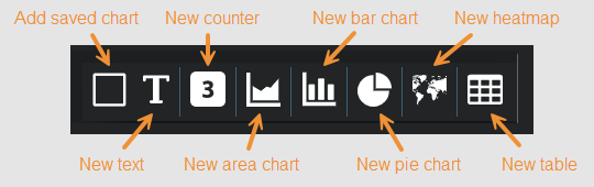
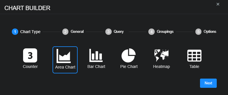
Custom Dashboard Components
When you edit a custom dashboard (Dashboards | Custom | <custom_dashboard_name> | Open in Visualizer | Edit), you can add these components:
-
Saved chart – A previously saved chart.
-
Text box – Use this to add static text.
-
Counter – Use this to add a dynamic count.
-
Area chart – Use this to visualize change over time.
-
Bar chart—use this to compare several categories.
-
Pie chart – Use this to see the distribution of items compared to the total.
-
Heatmap – Use this to see a geographic distribution of source or destination IP addresses.
-
Table – Use this to add a simple table of data.
To add a saved chart:
-
Select Add saved chart.
The selection screen appears.
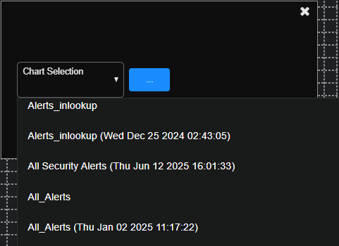
-
Choose a previously saved chart from the Chart Selection drop-down menu.
Stellar Cyber displays the chosen chart, which you can edit, delete, and reposition on the dashboard canvas.
To add a text box:
-
Select New text
Stellar Cyber immediately adds a text box and displays it on the dashboard canvas.
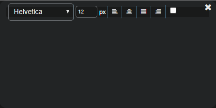
-
Enter and format your text.
After you complete the configuration, you can still edit and reposition the text box on the dashboard canvas later as well as delete it.
To add a counter chart:
-
Select New counter.
The Chart Builder dialog box appears with Counter selected.
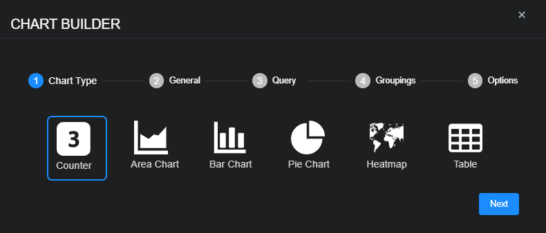
-
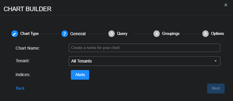
Select Next to view settings for the chart name, tenant whose data the chart displays, and the indices from which the chart retrieves data.
-
Enter a Chart Name, choose a Tenant, choose one or more Indices, and then select Next.
The Chart Name field does not support multibyte characters.
Special characters are not permitted in name fields for Queries, Lookup lists, or Reports/Dashboards. Letters, underscores, spaces, dashes, numbers and periods are permitted.
-
Choose a saved Query or create a new query and then select Next.
The query is optional.
To remove a selected query, set the query value to None. Deleting it completely removes it.
-
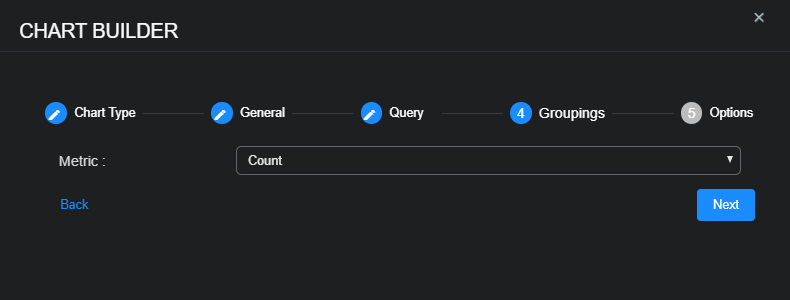
Choose the Metric you want the chart to use—Average, Count, Max, Min, or Sum—and then select Next.
-
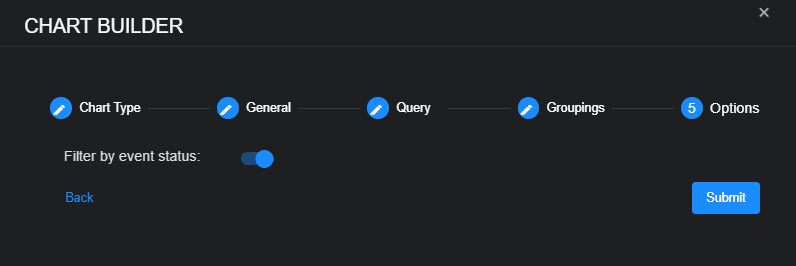
Use the Filter by event status option to specify whether data in the chart is subject to the global Status filter available in the main toolbar:
-
Enabled (default) – Chart data is filtered using the global Status filter in the main toolbar.
-
Disabled – Chart data is displayed regardless of the current setting of the global Status filter in the main toolbar.
-
-
Select Submit.
After you complete the configuration and submit it, Stellar Cyber displays the counter chart on the dashboard canvas. You can still edit and reposition the chart on the canvas later as well as delete it.
To add an area chart:
-
Select New area chart.
The Chart Builder dialog box appears with Area Chart selected.
-
Select Next to view settings for the chart name, tenant whose data the chart displays, and the indices from which the chart retrieves data.
-
Enter a Chart Name, choose a Tenant, choose one or more Indices, and then select Next.
The Chart Name field does not support multibyte characters.
Special characters are not permitted in name fields for Queries, Lookup lists, or Reports/Dashboards. Letters, underscores, spaces, dashes, numbers and periods are permitted.
-
Choose a saved Query or create a new query and then select Next.
The query is optional.
To remove a selected query, set the query value to None. Deleting it completely removes it.
-
Choose the form of data Aggregation and Field by which to group data, an Interval Time, an Interval Unit (from Millisecond to Year), and the Metric you want the chart to use—Average, Count, Max, Min, or Sum.
-
If you choose any Metric other than Count, also choose a Metric Field.
-
Select Next and then enter a Y-Axis Label for the area chart; for example,
Events. -
Use the Filter by event status option to specify whether data in the chart is subject to the global Status filter available in the main toolbar:
-
Enabled (default) – Chart data is filtered using the global Status filter in the main toolbar.
-
Disabled – Chart data is displayed regardless of the current setting of the global Status filter in the main toolbar.
-
-
Select Submit.
After you complete the configuration and submit it, Stellar Cyber displays the area chart on the dashboard canvas. You can still edit and reposition the chart on the canvas later as well as delete it.
To add a bar chart:
-
Select New bar chart.
The Chart Builder dialog box appears with Bar Chart selected.
-
Select Next to view settings for the chart name, tenant whose data the chart displays, and the indices from which the chart retrieves data.
-
Enter a Chart Name, choose a Tenant, choose one or more Indices, and then select Next.
The Chart Name field does not support multibyte characters.
Special characters are not permitted in name fields for Queries, Lookup lists, or Reports/Dashboards. Letters, underscores, spaces, dashes, numbers and periods are permitted.
-
Choose a saved Query or create a new query and then select Next.
The query is optional.
To remove a selected query, set the query value to None. Deleting it completely removes it.
-
Define the parameters of the data that you want the bar chart to display:
Aggregation: Choose the form of data aggregation that you want the chart to use.
-
Choose Term to group data by the text in the fields. This is useful when your data is text, such as tenant names.
-
Choose Range to group data by ranges. This is useful when your data is numeric, such as severity.
-
Choose Filter to define one or more filters for the data groups.
Then, configure the necessary settings, which differ based on your choice of aggregation.
-
-
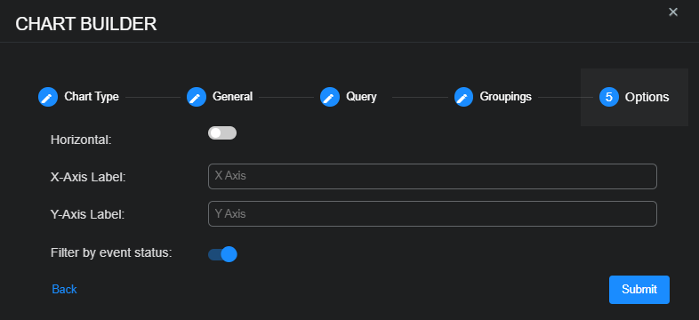
Select Next and then define the orientation and x- and y-axis labels of the bar chart.
-
By default, the bars in the chart are displayed vertically. Choose Horizontal to display the bars horizontally.
-
Enter optional labels for the X and Y axes.
-
-
Use the Filter by event status option to specify whether data in the chart is subject to the global Status filter available in the main toolbar:
-
Enabled (default) – Chart data is filtered using the global Status filter in the main toolbar.
-
Disabled – Chart data is displayed regardless of the current setting of the global Status filter in the main toolbar.
-
-
Select Submit.
The chart is added and your canvas is displayed. You can still edit, delete, and move your chart.
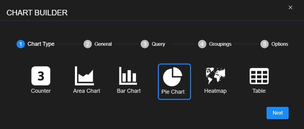
To add a pie chart:
-
Select New pie chart.
The Chart Builder dialog box appears with Pie Chart selected.
-
Select Next to view settings for the chart name, tenant whose data the chart displays, and the indices from which the chart retrieves data.
-
Enter a Chart Name, choose a Tenant, choose one or more Indices, and then select Next.
The Chart Name field does not support multibyte characters.
Special characters are not permitted in name fields for Queries, Lookup lists, or Reports/Dashboards. Letters, underscores, spaces, dashes, numbers and periods are permitted.
-
Choose a saved Query or create a new query and then select Next.
The query is optional.
To remove a selected query, set the query value to None. Deleting it completely removes it.
-
Define the parameters of the data that you want the pie chart to display and then select Next:
Aggregation: Choose the form of data aggregation that you want the chart to use.
-
Choose Term to group data by the text in the fields. This is useful when your data is text, such as tenant names.
-
Choose Range to group data by ranges. This is useful when your data is numeric, such as severity.
-
Choose Filter to define one or more filters for the data groups.
Then, configure the necessary settings, which differ based on your choice of aggregation.
-
-
Use the Filter by event status option to specify whether data in the chart is subject to the global Status filter available in the main toolbar:
-
Enabled (default) – Chart data is filtered using the global Status filter in the main toolbar.
-
Disabled – Chart data is displayed regardless of the current setting of the global Status filter in the main toolbar.
-
-
Select Submit.
The chart is added and your canvas is displayed. You can still edit, delete, and move your chart.
To switch between a pie chart and a donut chart, simply click the or icon in the upper right corner of the component after you save the dashboard.
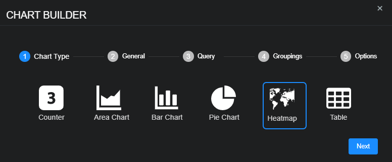
To add a heatmap:
-
Select New heatmap.
The Chart Builder dialog box appears with Heatmap selected.
-
Select Next to view settings for the chart name, tenant whose data the chart displays, and the indices from which the chart retrieves data.
-
Enter a Chart Name, choose a Tenant, choose one or more Indices, and then select Next.
The Chart Name field does not support multibyte characters.
Special characters are not permitted in name fields for Queries, Lookup lists, or Reports/Dashboards. Letters, underscores, spaces, dashes, numbers and periods are permitted.
-
Choose a saved Query or create a new query and then select Next.
The query is optional.
To remove a selected query, set the query value to None. Deleting it completely removes it.
-
Choose the Field type by which you want to group the data in the pie chart:
-
dstip_geo_point – Visualizes data using geographic locations derived from destination IP addresses that match the query in the previous steps and plots points for them on a heatmap. This helps identify where outbound traffic is targeting.
-
hostip_geo_point – Visualizes data using geographic locations derived from internal host IP addresses and plots points for them on a heatmap. This can help map internal systems, though private IPs may not always yield meaningful geo-locations.
-
location_geo_point – Visualizes data using geographic locations derived from enriched or user-defined location fields and plots points for them on a heatmap. This offers flexibility when using connector-enriched or metadata-based geographic data.
-
remote_ip_geo_point – Visualizes data using geographic locations derived from remote system or user IP addresses and plots points for them on a heatmap. This is useful for visualizing connections from remote users, such as VPNs or cloud access.
-
srcip_geo_point – Visualizes data using geographic locations derived from source IP addresses that match the query in the previous steps and plots points for them on a heatmap. This helps track where connections originate.
-
-
Choose the type of Metric to use for the Field. You can choose from Average, Count, Max, Min, or Sum.
-
If you choose any Metric other than Count, also choose a Metric Field.
-
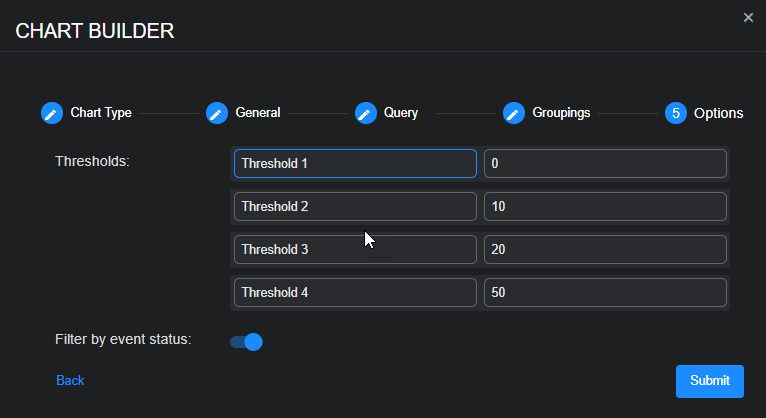
Select Next and then name and set your thresholds.
The thresholds specify at what value the heatmap changes the color codes of geopoints shown in the display. This way, geopoints with a higher count are displayed, for example, in red.
-
Use the Filter by event status option to specify whether data in the chart is subject to the global Status filter available in the main toolbar:
-
Enabled (default) – Chart data is filtered using the global Status filter in the main toolbar.
-
Disabled – Chart data is displayed regardless of the current setting of the global Status filter in the main toolbar.
-
-
Select Submit.
The heat map is added and your canvas is displayed. You can still edit, delete, and move your chart. Be sure to save your changes when you are done.
Heatmap Example
The figure below illustrates a sample heatmap based on the following settings:
-
Chart Name: Alerts by Geo
-
Tenant: All Tenants
-
Indices: Alerts
-
Query: --
-
Field: srcip_geo_point
-
Metric: Count
-
Thresholds: (default settings)
-
Filter by event status: (default setting: enabled)
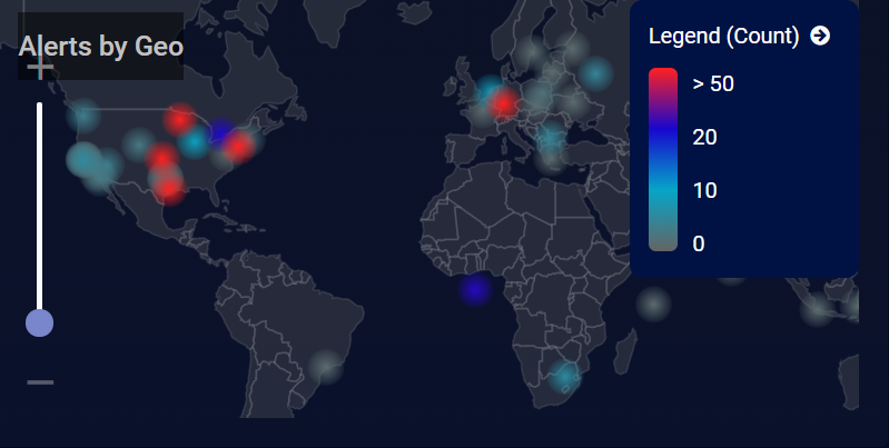
Note the following:
-
We configured the chart to display a heatmap based on the source IP addresses of detected alerts. The color-coded geopoints illustrate at a glance where the greatest number of alerts are concentrated based on the legend at the right of the heatmap.
-
Alerts are clustered into geopoints using an ElasticSearch GeoHash precision of 5, resulting in boxes of 4.9km x 4.9 km. For this example, this means that a geopoint shown in the heatmap represents all alerts within that 4.9km x 4.9km box.
-
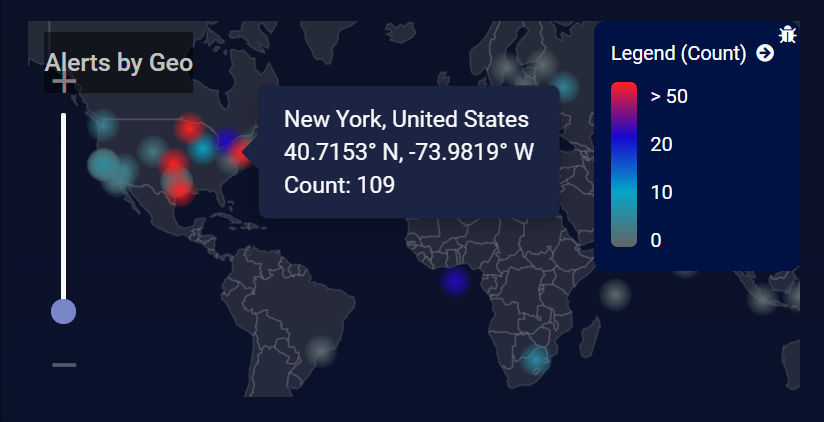
Hover your mouse over any geopoint displayed in the heatmap to see its location, coordinates, and metric count. The example below shows a cluster of 109 alerts in the New York area.
-
You can zoom in and out of the heatmap using the slider on the left.
To add a table:
-
Select New table.
The Chart Builder dialog box appears with Table selected.
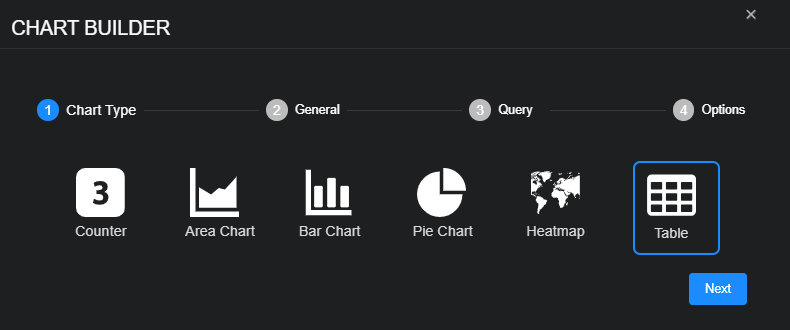
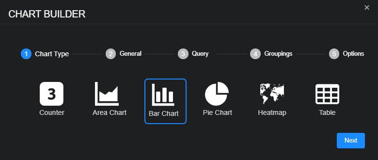
This section of the chart builder is titled Chart Type.
-
Select Next to view settings for the chart name, tenant whose data the chart displays, and the indices from which the chart retrieves data.
This section of the chart builder is titled General.
-
Enter a Chart Name, choose a Tenant, and then choose one or more Indices.
The Chart Name field does not support multibyte characters.
Special characters are not permitted in name fields for Queries, Lookup lists, or Reports/Dashboards. Letters, underscores, spaces, dashes, numbers and periods are permitted.
-
Choose the Table Type—either Per record or Groupings—and then select Next.
Per record: This table type displays individual Interflow records exactly as they appear in the dataset, without any aggregation. Use this option when you want detailed, event-level visibility, such as examining specific alerts, logs, or user actions in raw form.
Groupings: This table type summarizes data by aggregating records based on selected fields. It is best suited for identifying patterns or trends, such as total event counts per IP address or average session duration per user, enabling higher-level analysis.
The Table Type determines how many sections are in the chart builder.
-
When the table displays data per record, there are four sections: Chart Type, General, Query, and Options.
-
When the table displays data in groupings, there is an additional section for a total of five: Chart Type, General, Query, Groupings, and Options.
After you select Next, the chart builder advances to the Query section.
-
-
Choose a saved Query or create a new query and then select Next.
The query is optional.
To remove a selected query, set the query value to None. Deleting it completely removes it.
The next section of the chart builder depends on the table type you selected in the General section. If the table type is Per record, the next section is Options (skip the next step). If the table type is Groupings, the next section is Groupings and then Options after that.
-
If you chose Groupings as the table type, configure a grouping for Column 1 in the Groupings tab.
Each column in a Groupings table defines how to group and summarize data from Interflow records. You can add multiple columns, and the groupings will be processed sequentially from left to right.
Below is a detailed explanation of each Aggregation type and the dynamic options that appear for each.
-
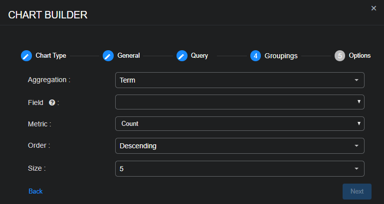
Term: Use this to group records based on exact values of a field. A possible use case might be to show the top ten destination IP addresses by event count.
-
Field: Choose a text-based field such as
srcip,event.name, ortenant_name. -
Metric: Select a summary operation: Average, Count (the default), Max, Min, or Sum.
-
Metric Field: If you choose any Metric other than Count, also choose a Metric Field.
-
Order: Choose Ascending or Descending to control the sort order of group results.
-
Size: Specify how many top groups to show.
-
-
Range: Use this to group numeric values into named ranges. For example, you might categorize severity into low (0-30), medium (31-70), and high (71-100).
-
Field: Choose a numeric field such as
severity,fidelity, ortotalbytes. -
+ Range: Select to add one or more custom ranges.
-
Custom name for a range (optional): Enter a label for the range; for example,
Low,Medium, andHigh. -
≥: Enter an inclusive lower bound to start the range.
-
<: Enter an upper bound to end the range.
-
-
Filter: Use this to group data into logical buckets defined by filters. Use either + Filter or + Query String Filter. For detailed information about configuring filters, see Queries and Filters.
-
Metric: Use this to compute a single value over all matching records. It does not group records but simply returns a summary value. You might use this, for example, to display the average fidelity across all Interflow records.
-
Metric: Chose Average, Count, Max, Min, or Sum.
-
Field: If the Metric is not Count, choose a numeric field to summarize the data; for example,
totalbytes,duration, orfidelity.
-
-
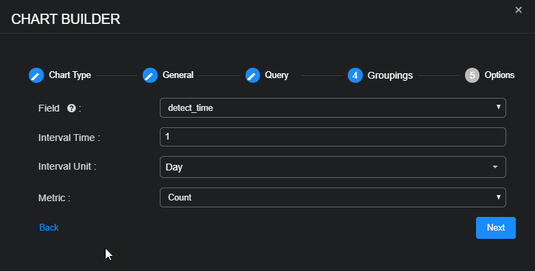
Date histogram: Use this to group records into fixed time intervals. For example, you might group events by day to show trends over time.
-
Field: Choose a time-based field, such as
event.timestamp. -
Interval Time: Enter a numeric value.
-
Interval Unit: Select the time unit: Millisecond, Second, Minute, Hour, Day, Week, Month, or Year.
-
You can add another column to the table with another grouping of data by selecting + Add Grouping and repeating the previous instructions to configure Column 2.
When you select Next, the next section is Options.
-
-
If you chose Per record as the table type in the General section of the chart builder, configure the following in the Options section:
-
Select + Column to add one or more columns to the table.
-
Choose the field name for the data to display in each column and enter a title for each column.
-
Enter the field to Sort By and choose the Rows per Page to define how many rows to display for each page.
If you chose Groupings as the table type in the General section of the chart builder, choose how many Rows per Page to display.
-
-
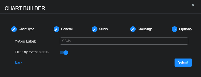
Use the Filter by event status option to specify whether data in the chart is subject to the global Status filter available in the main toolbar:
-
Enabled (default) – Chart data is filtered using the global Status filter in the main toolbar.
-
Disabled – Chart data is displayed regardless of the current setting of the global Status filter in the main toolbar.
-
-
Select Submit.
The table is added and your canvas is displayed. You can still edit, delete, and move your table. Here are examples of tables to look at events by:
