Using Chart Builder
This topic describes how to access a table of all previously created charts and tables used in Dashboards or Reports. It also describes how to edit or delete existing charts using the Chart Builder, as well as how to create new charts for later use.
Access the Chart Builder as follows:
-
From the Visualize | Creation menu, create or edit from the displayed list of existing charts.
-
From within Dashboards, you can create and modify charts in that dashboard.
Visibility of items in this table are restricted based on Tenant.
As of v4.3.0, the availability of certain components (such as charts, correlations, ATH rules) with tenant visibility settings has changed. Specifically, the top level component cannot have a less restrictive visibility than its children components.
-
For any component, such as a query you create, with visibility set to All Tenants, then all its sub-components (such as a lookup list) must also be set to All Tenants.
-
Similarly, if a component is set for a specific tenant, then all its sub-components must be specified for either that tenant or All Tenants.
Working with the Charts List
When you launch charts from the Visualize | Creation | Charts menu, a list of existing charts is displayed. From here, you can manage charts, and create new ones, either from scratch or by cloning an existing chart. These are displayed in a table that can be sorted, searched and exported in the same way as other tables in Stellar Cyber.
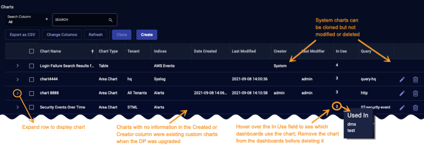
Use the charts list to manage the charts available for display in dashboards throughout the Stellar Cyber product. Note the following:
-
Dashboards created by System are default and cannot be modified or deleted. Instead, clone the chart and modify the copy.
-
Custom charts created prior to upgrade of a system to Stellar Cyber v4.2.0, which introduced several new fields in this list, have blank values in those fields (such as Creator or Date Created ). This is expected.
-
The In Use field, introduced in Stellar Cyber v4.2.0, allows you to see which dashboards are affected by changes you make to the chart.
-
Before you are permitted to delete a chart, you must remove it from any associated dashboards. Hover your mouse over the In Use field to identify dashboards using that chart. Navigate to Visualize | Creation | Dashboards to access and modify the dashboards.
-
When cloning a chart, make sure that the source chart does not include any special characters in its name. Chart Builder prevents you from creating new charts with disallowed special characters but does not prevent cloning of existing charts with disallowed special characters. Letters, underscores, spaces, dashes, numbers and periods are permitted.
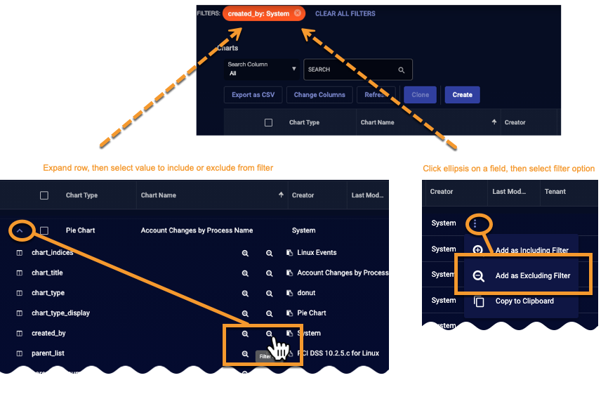
The charts list, like many tables in Stellar Cyber, supports export, sorting, edit, and delete operations. You can use the a couple of options to filter charts based on any of the chart attributes. Expand a row and select the attribute, or click the ellipsis button on a field and then select the filter option
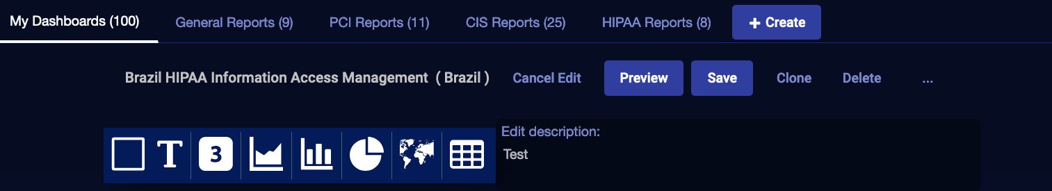
Creating and Editing Charts
When you click create or edit from the Chart Builder table, or from a Dashboard, the chart builder tool opens.
| Launched From Menu | Launched from a Dashboard |
|---|---|
|
|
|
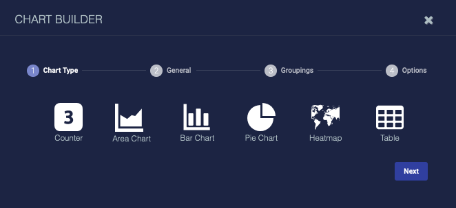
From either launch point you can use the following features to create or modify a chart:
-
Counter—use this to add a dynamic count
-
Area chart—use this to visualize change over time
-
Bar chart—use this to compare several categories
-
Pie chart—use this to see the distribution of items compared to the total
-
Heatmap—use this to see a geographic distribution
-
Table—use this to add a simple table of data
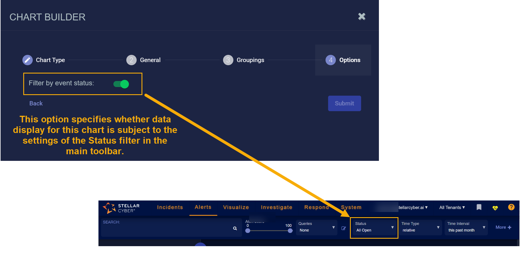
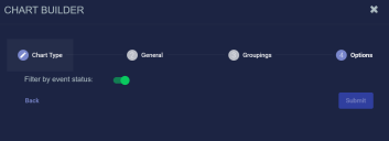
About the "Filter by event status" Option 
Regardless of the type of chart you are creating, the Chart Builder's last step lets you configure the Filter by event status option. This feature specifies whether data in this chart is subject to the global Status filter available in the main toolbar:
-
Enabled (default) – Chart data can be filtered using the global Status filter in the main toolbar.
-
Disabled – Chart data is displayed regardless of the current setting of the global Stats filter in the main toolbar.
The figure below summarizes how this option works:
Adding a Count
To add a count:
-
Click Counter. The Chart Builder dialog box appears.
-
Enter the Chart Name. Ours is Data Ingestion Anomalies. This field does not support multibyte characters.
Special characters are not permitted in name fields for Queries, Lookup lists, Reports/Dashboards. Letters, underscores, spaces, dashes, numbers and periods are permitted.
-
Choose the Tenant. We chose All Tenants.
-
Choose the Indices. We chose Alerts.
-
Choose a saved Query or create a new query. The query is optional.
To remove a selected query, set the query value to None. Deleting it completely removes it.
-
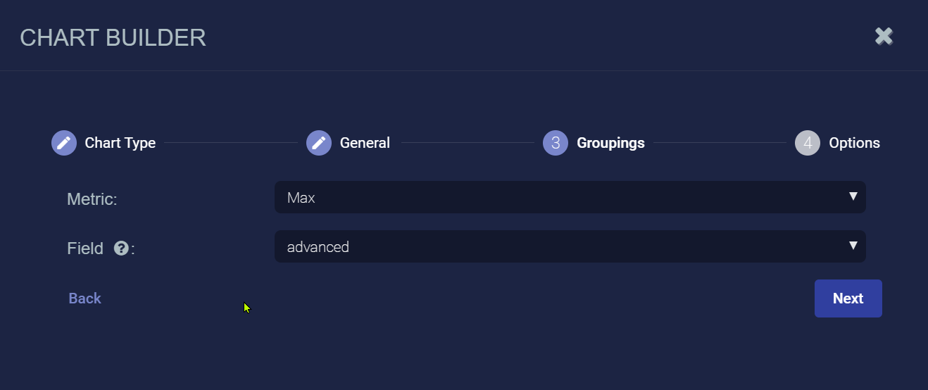
Click Next. The Groupings tab is displayed.
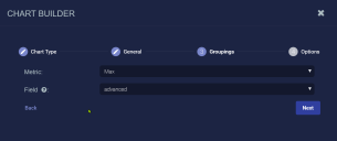
-
Choose the Metric. We chose Max and selected a metric in the displayed field.
-
Click Next. The Options tab is displayed.
-
Use the Filter by status option to specify whether data in this chart is subject to the global Status filter available in the main toolbar:
-
Enabled (default) – Chart data can be filtered using the global Status filter in the main toolbar.
-
Disabled – Chart data is displayed regardless of the current setting of the global Stats filter in the main toolbar.
-
-
Click Submit.


Adding an Area Chart
To add an area chart:
-
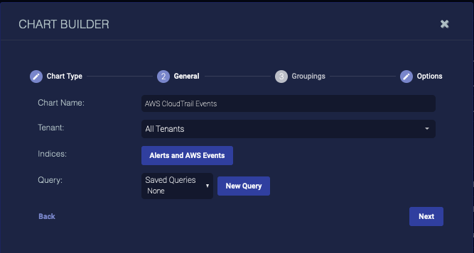
Click New area chart. The Chart Builder dialog box appears.
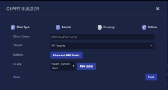
-
Enter the Chart Name. Ours is AWS CloudTrail Events. This field does not support multibyte characters.
Special characters are not permitted in name fields for Queries, Lookup lists, Reports/Dashboards. Letters, underscores, spaces, dashes, numbers and periods are permitted.
-
Choose the Tenant. We chose All Tenants.
-
Choose the Indices. We chose the Alerts and AWS Events indices.
-
Choose a saved Query or create a new query. The query is optional.
To remove a selected query, set the query value to None. Deleting it completely removes it.
-
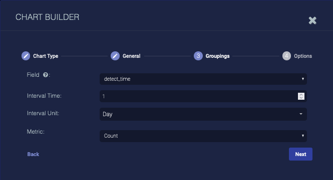
Click Next. The Groupings tab appears.
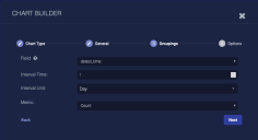
-
Choose the Field to group by. We set detect_time.
-
Choose the Interval Time.
-
Choose the Interval Unit.
-
Choose the Metric. We left it as Count.
If you choose anything but Count, enter the Metric Field.
-
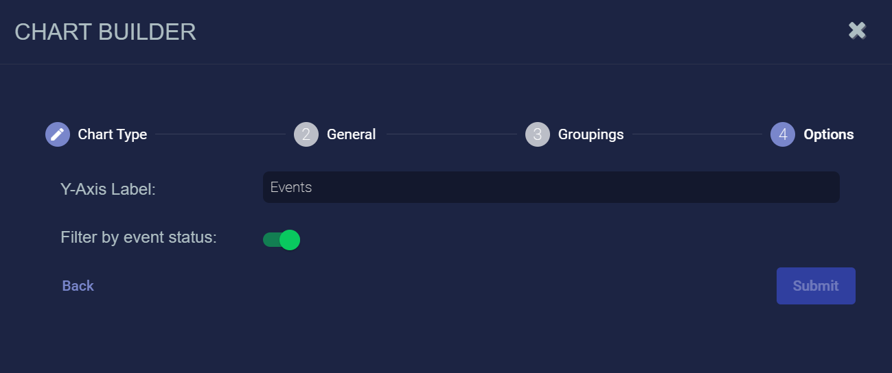
Click Next. The Options tab appears.

-
Enter a Y-Axis Label.
-
Use the Filter by status option to specify whether data in this chart is subject to the global Status filter available in the main toolbar:
-
Enabled (default) – Chart data can be filtered using the global Status filter in the main toolbar.
-
Disabled – Chart data is displayed regardless of the current setting of the global Stats filter in the main toolbar.
-
-
Click Submit.
Adding a Bar Chart
To add a bar chart:
-
Click New bar chart. The Chart Builder dialog box appears.

-
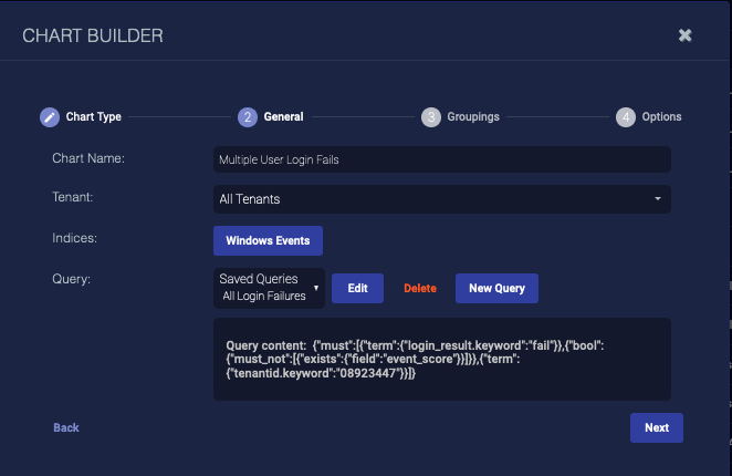
Enter the Chart Name. Ours is Multiple User Login Fails. This field does not support multibyte characters.
Special characters are not permitted in name fields for Queries, Lookup lists, Reports/Dashboards. Letters, underscores, spaces, dashes, numbers and periods are permitted.
-
Choose the Tenant. We chose All Tenants.
-
Choose the Indices. We chose Windows Events.
-
Choose a saved Query or create a new query. The query is optional.
To remove a selected query, set the query value to None. Deleting it completely removes it.
-
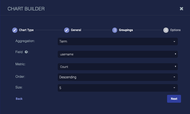
Click Next. The Groupings tab appears.
-
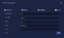
Choose the Aggregation. Choose Term to group data by the text in the fields (useful when your data is text, such as tenant names), choose Range to group data by ranges (useful when your data is numeric, such as severity), or choose Filter to define filters for the data groups.
Define your aggregation. The options differ based on your choice.
-
Click Next. The Options tab appears.

-
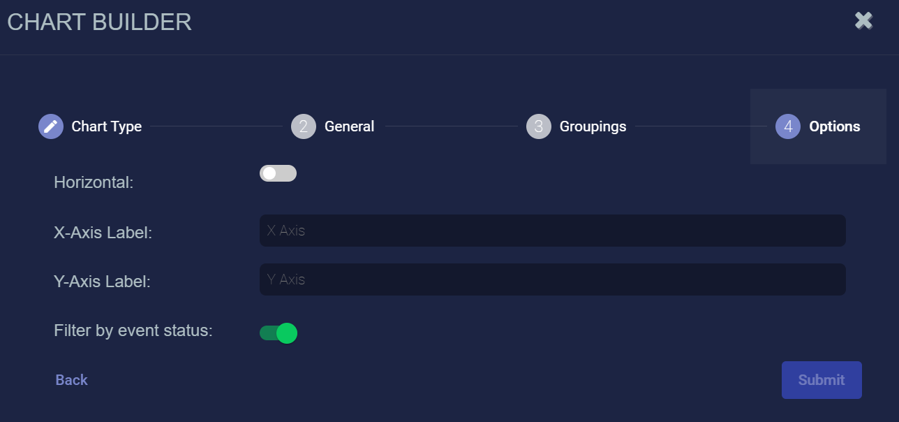
Choose Horizontal to display the bars horizontally.
-
Enter optional labels for the axes.
-
Use the Filter by status option to specify whether data in this chart is subject to the global Status filter available in the main toolbar:
-
Enabled (default) – Chart data can be filtered using the global Status filter in the main toolbar.
-
Disabled – Chart data is displayed regardless of the current setting of the global Stats filter in the main toolbar.
-
-
Click Submit.
Adding a Pie Chart
To add a pie chart:
-
Click New pie chart. The Chart Builder dialog box appears.

-
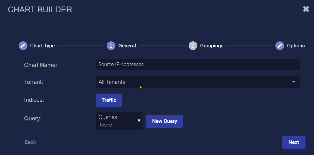
Enter the Chart Name. Ours is Source IP Addresses. This field does not support multibyte characters.
Special characters are not permitted in name fields for Queries, Lookup lists, Reports/Dashboards. Letters, underscores, spaces, dashes, numbers and periods are permitted.
-
Choose the Tenant. We chose All Tenants.
-
Choose the Indices. We chose Traffic.
-
Choose a saved Query or create a new query. The query is optional.
To remove a selected query, set the query value to None. Deleting it completely removes it.
-
Click Next. The Groupings tab appears.

-
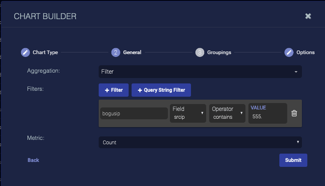
Choose the Aggregation. Choose Term to group data by the text in the fields (useful when your data is text, such as tenant names), choose Range to group data by ranges (useful when your data is numeric, such as severity), or choose Filter to define filters for the data groups. The options differ based on your choice. In this example, we illustrate the fields that display when you add a basic filter. Define your aggregation.
-
Click Next. The Options tab is displayed.
-
Use the Filter by status option to specify whether data in this chart is subject to the global Status filter available in the main toolbar:
-
Enabled (default) – Chart data can be filtered using the global Status filter in the main toolbar.
-
Disabled – Chart data is displayed regardless of the current setting of the global Stats filter in the main toolbar.
-
-
Click Submit.
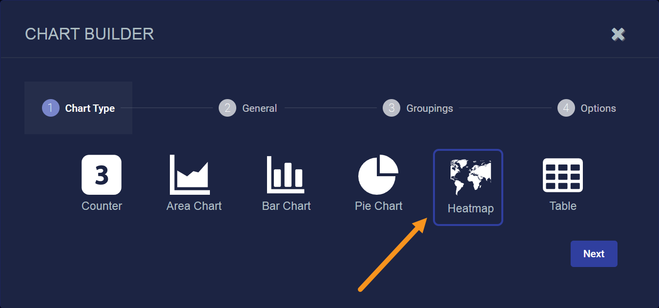
Adding a Heatmap
To add a heatmap:
-
Click New heatmap.
The Chart Builder dialog box appears with Heatmap selected.

-
Click Next.
-
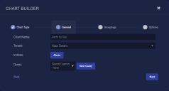
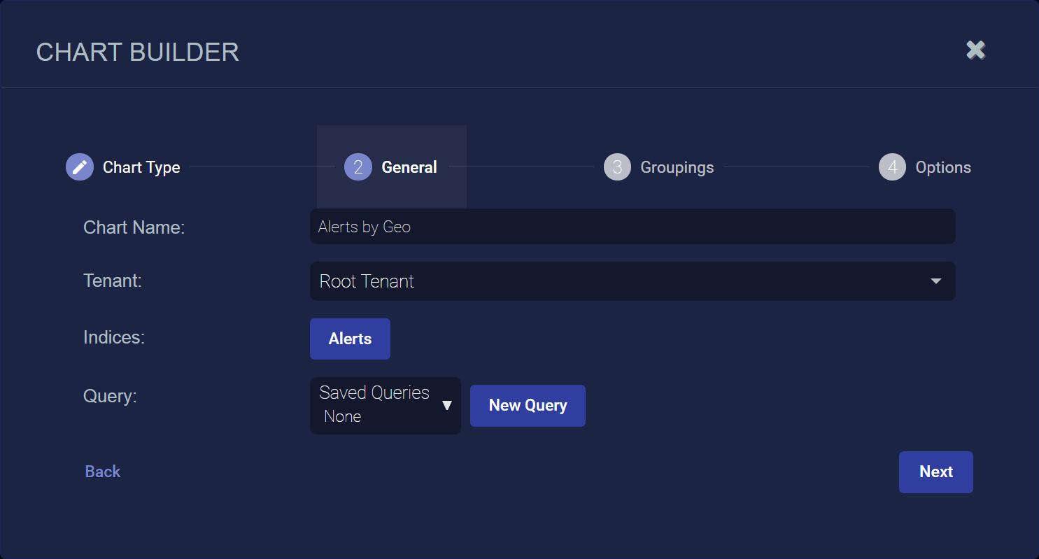
Enter the Chart Name. Ours is Alerts by Geo. This field does not support multibyte characters.
Special characters are not permitted in name fields for Queries, Lookup lists, Reports/Dashboards. Letters, underscores, spaces, dashes, numbers and periods are permitted.
-
Choose the Tenant. We chose All Tenants.
-
Choose the Indices. We chose Alerts.
-
Choose a saved Query or create a new query. The query is optional.
To remove a selected query, set the query value to None. Deleting it completely removes it.
Here's how the Chart Builder looks with our settings so far:
-
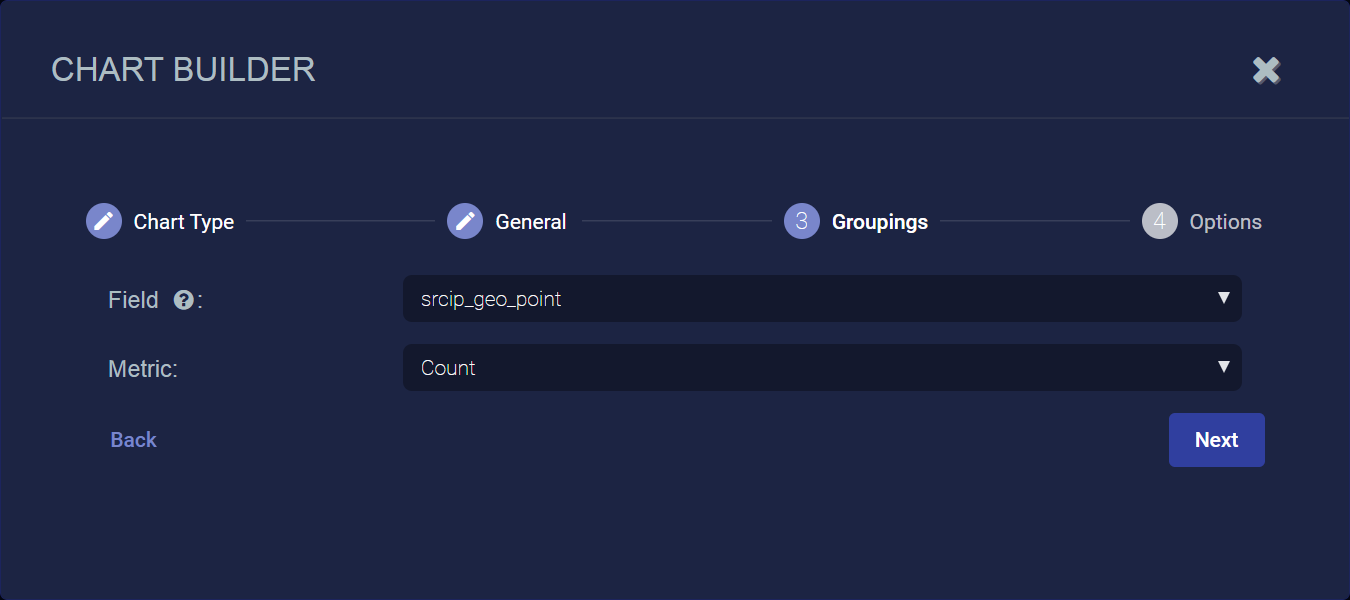
Click Next. The Groupings tab appears.
-
Choose one of the following Field types:
-
dst_ip_geopoint – Show heatmap based on destination IP addresses matching the query in the previous steps.
-
src_ip_geopoint – Show heatmap based on source IP addresses matching the query in the previous steps.
-
-
Choose the type of Metric to use for the Field. You can choose from Average, Count, Max, Min, or Sum. We have chosen Count so that the heatmap will display clusters based on alert counts.

-
Click Next. The Options tab appears.
-
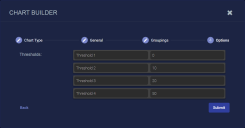
Name and set your thresholds. The thresholds specify at what value the heatmap will change the color codes of geopoints shown in the display. This way, geopoints with a higher count are displayed, for example, in red.
-
Use the Filter by status option to specify whether data in this chart is subject to the global Status filter available in the main toolbar:
-
Enabled (default) – Chart data can be filtered using the global Status filter in the main toolbar.
-
Disabled – Chart data is displayed regardless of the current setting of the global Stats filter in the main toolbar.
-
-
Click Submit.

For more on heatmaps and converting them from previous releases, refer to the related Dashboard component topic.
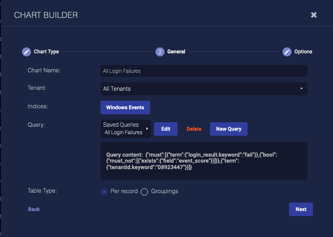
Adding a Table
To add a table:
-
Click New table. The Chart Builder dialog box appears.
-
Enter the Chart Name. Ours is All Login Failures. This field does not support multibyte characters.
Special characters are not permitted in name fields for Queries, Lookup lists, Reports/Dashboards. Letters, underscores, spaces, dashes, numbers and periods are permitted.
-
Choose the Tenant. We chose All Tenants.
-
Choose the Indices. We chose Windows Events.
-
Choose a saved Query or create a new query. The query is optional.
To remove a selected query, set the query value to None. Deleting it completely removes it.
-
Choose the Table Type. We left it as Per record.
-
Click Next. The Groupings tab appears if you chose the Groupings type. We chose Per record, so the Options tab appears.

-
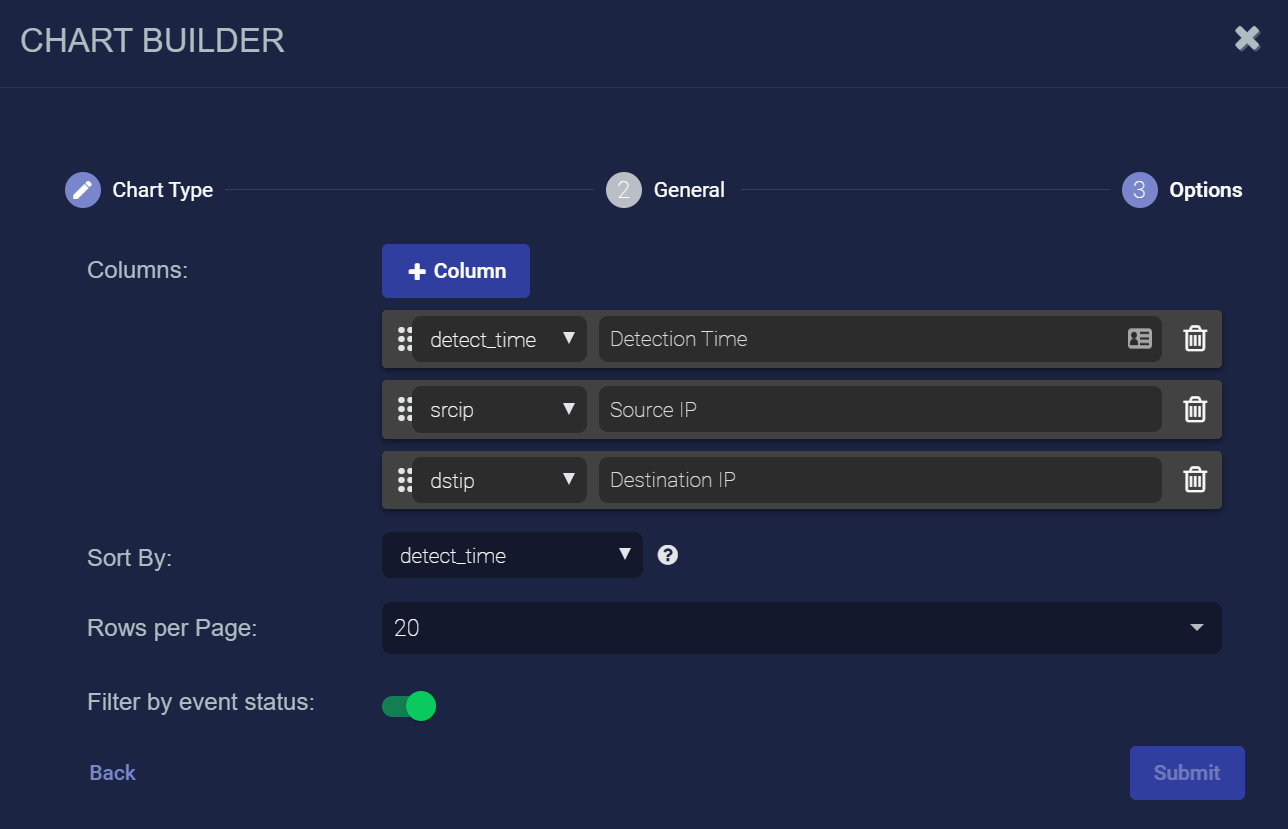
Click the + Column button to add columns.
-
Choose the data for each column.
-
Enter a title for each column.
-
Enter the column to Sort By if you want.
-
Choose the Rows per Page.
-
Use the Filter by status option to specify whether data in this chart is subject to the global Status filter available in the main toolbar:
-
Enabled (default) – Chart data can be filtered using the global Status filter in the main toolbar.
-
Disabled – Chart data is displayed regardless of the current setting of the global Stats filter in the main toolbar.
-
-
Click Submit.