Using the Analysis Tab in the Case Detail View 
The Case Detail view's Analysis tab provides a graphical display that helps you visualize a coalesced view of an ongoing attack. Separate entries in the display represent internal  or external
  hosts, as well as URLs
  , files, users
  , services
  , processes
  , and sensor status alerts
  .
.
Solid lines between the displayed entities represent events taking place between different entities, while dotted lines represent parent/child relationships. The nodes themselves represent objects, users, hosts, or services.
Consider the sample Analyze workspace for a case involving an Internal Ransomware attach shown below:
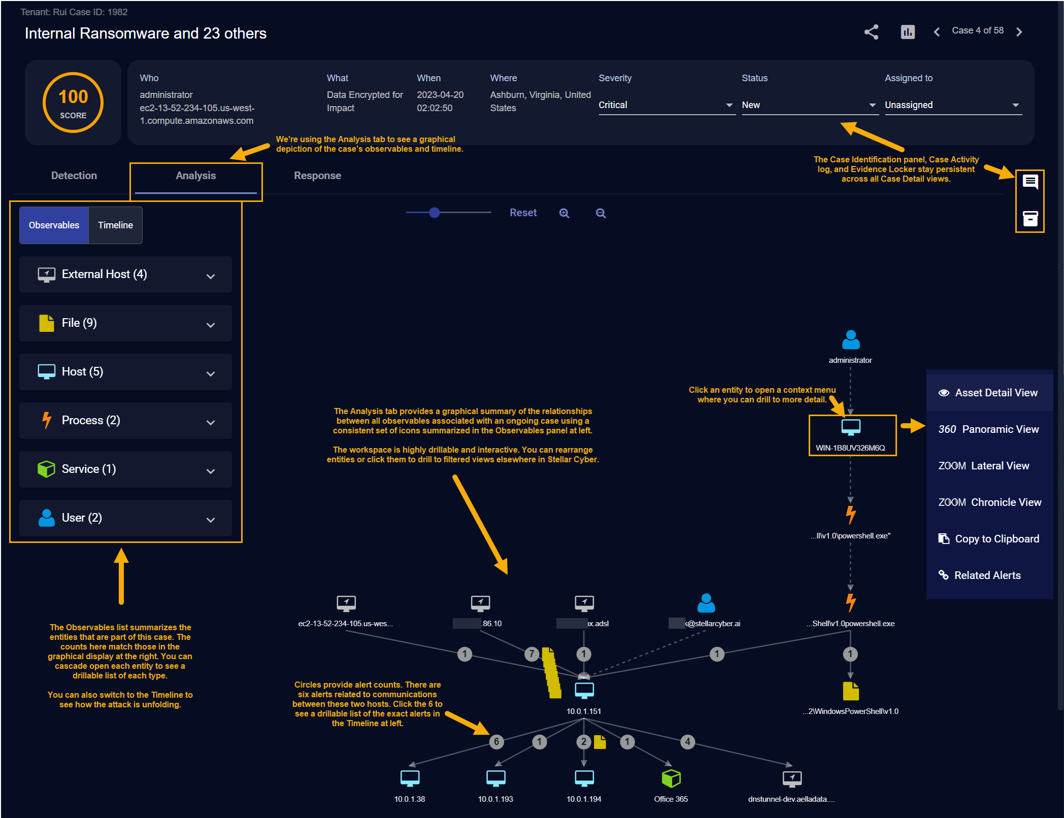
We can see at a glance the following:
-
The Observables legend at the right of the display shows us that this case involves four external hosts, nine files, five internal hosts, two processes, one service, and two users. This is confirmed by the graphical representation in the main workspace.
-
You can click any entity in the Analyze workspace to display a context menu with additional drilldown options for further analysis. The figure above shows the context menu for the WIN-1B8UV326M6Q internal host.
-
The case includes 6alerts between 10.0.1.151 and 10.0.1.38. Similarly, there is a single alert between 10.0.1.151 and the Office 365 service.
-
You can click on any of the circular alert indicators in the display to view a Timeline of those alerts at left.
-
You can click the button for any alert in the Timeline to see its associated Event Display, including the supporting Interflow data.
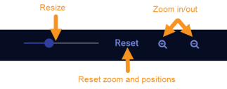
Rearranging the Analysis Workspace
You can rearrange and adjust the Analysis workspace to suit your needs using any of the following techniques:
-
Click and drag any node in the display to change its position. This can be handy when you want to zero in on an particular host that's part of a case with many other hosts.
-
Click and drag on the background of the workspace to move the entire collection of nodes and lines around the workspace.
-
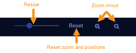
Use the controls at the top of the display to resize, reset, and zoom the display:
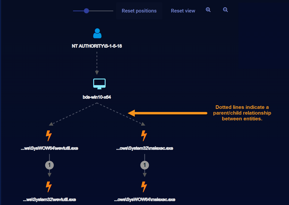
Solid Lines vs. Dotted Lines in the Analysis Workspace
The Analysis workspace represents events taking place between different entities with solid lines, while dotted lines represent parent/child relationships. For example, the dotted lines in the figure below indicate a parent/child relationship between a host and a process:
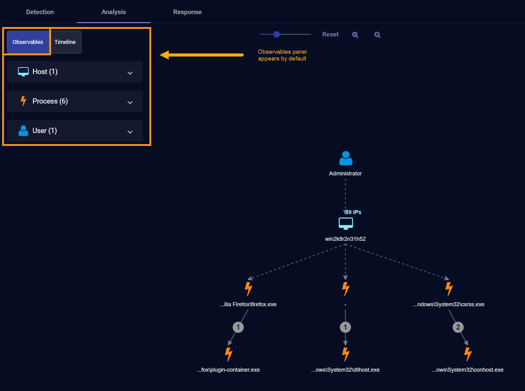
About the Observables Panel
When you first display the Analysis tab, the Observables panel appears by default at the left of the Analysis workspace, summarizing the different types of entities associated with the case, along with a count of each:
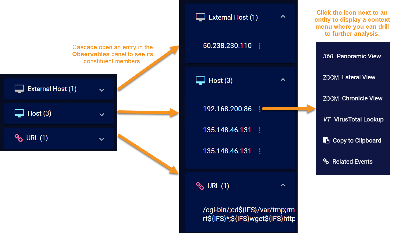
You can cascade open the entry for any of the entities associated with the case to see a list of the actual constituent entities. Depending on the type of entity, you can click the  button adjacent to an entry to display a context menu where you can drill to further details elsewhere in the Stellar Cyber interface. For example, the figure below illustrates the context menu for a drilldown on a host. You could also see users, services, URLs, files, processes, and registry values listed in Observables, depending on the nature of the case.
About the Timeline Panel
You can toggle the Analysis tab between displaying the Observables or Timeline panel by clicking the corresponding button at the top left of the workspace.
By default, the Timeline panel shows all alerts associated with the case in descending chronological order, from newest to oldest, along with an indication of the elapsed time between each event. You can reverse the sort order by clicking the arrow at the top of the Timeline, as illustrated below:
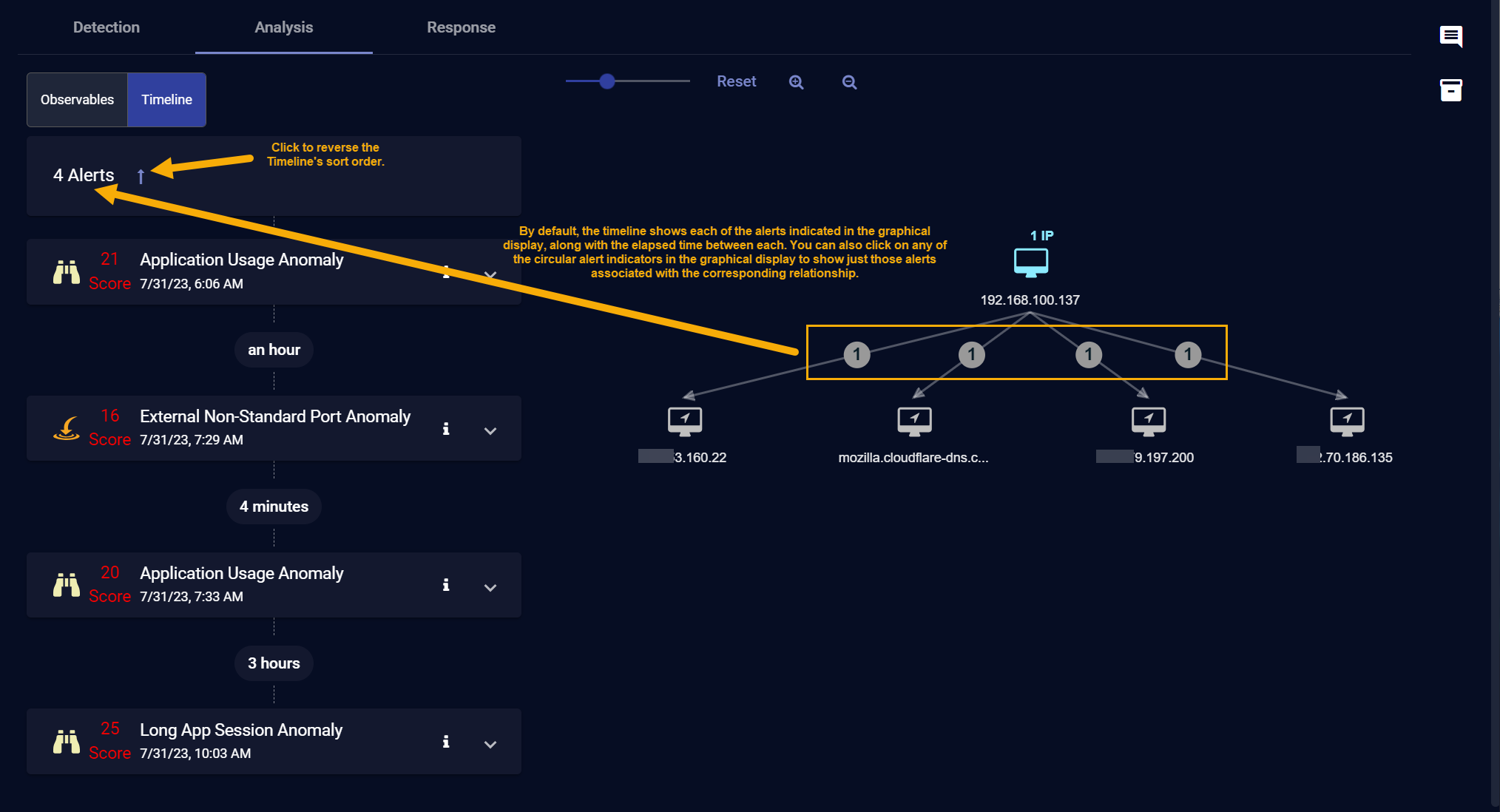
You can also click on any of the circular alert indicators in the graphical display to filter the Timeline so it shows just those alerts associated with the corresponding relationship.
Understanding Alert Entries in the Timeline
Alerts are displayed in the Timeline in individual panels. Panels appear initially as collapsed summaries, but can be toggled open by clicking the ˅ button at the right of an alert entry, as illustrated below:
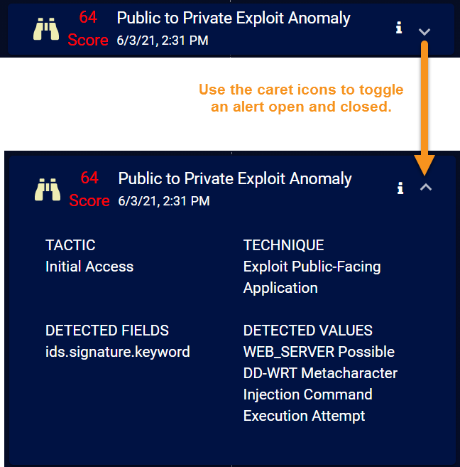
Alerts are displayed in the Timeline with the following information:
-
XDR Kill Chain Stage/Alert Type – A distinctive icon indicates either the XDR Kill Chain stage of the alert or the alert type. For example:
-
 Initial Attempts
 -
 Persistent Foothold
 -
 Exploration
 -
 Propagation
 -
 Exfiltration & Impact
-
-
Score – A color-coded numerical score indicates the severity of the case. Scores are updated dynamically as new events are added to the case or you remove alerts.
-
Name – The name of the alert.
-
Timestamp – The date and time at which the alert was reported by Stellar Cyber.
-
Event Display – Click the button for any alert in the Timeline to see its associated Event Display, including the supporting Interflow data.
-
Tactic – The tactic for the alert, based on the MITRE | ATT&CK framework .
-
Technique – The technique for the alert, based on the MITRE | ATT&CK framework .
-
Description – A one-line summary of the alert.
Drilling Down from the Analysis Tab
The Analysis tab provide multiple options for contextual drilldown to further analysis elsewhere in Stellar Cyber:
-
When you click an entity in the Analysis tab or the
button in the Observables list, a context menu appears similar to the illustration in Observables, above. The exact options available depend on the type of entity you clicked and the additional information available and include the following:-
Asset Detail View – Opens the Investigate | Asset Analytics | Asset Details tab for the selected friendly name, hostname, or IP address as the filter.
-
360 Panoramic View – Opens the Investigate | Panoramic view with the selected friendly name, hostname, or IP address as the filter.
-
ZOOM Lateral View – Opens Investigate | Threat Hunting to the ZOOM tab. The Lateral view displayed with the friendly name, hostname, or IP address as the focus.
-
ZOOM Chronicle View – Opens Investigate | Threat Hunting to the ZOOM tab. The Chronicle view displayed with the friendly name, hostname, or IP address as the focus.
The ZOOM feature is deprecated in 4.3.7 and will be removed in a future release.
-
VT VirusTotal Lookup – Performs a lookup on virustotal.com for the selected friendly name, hostname, or IP address.
-
Add as Including Filter – Creates a filter to display only those events containing the value in the field.
-
Add as Excluding Filter – Filters out those events containing the value in the field.
-
Copy to Clipboard – Copies the field value to the clipboard so it can be pasted elsewhere.
-
Related Alerts – Opens Investigate | Threat Hunting to the Interflow tab with a search performed on the corresponding entity.
-
-
Event Display – Click the button for any alert in the Timeline to see its associated Event Display, including the supporting Interflow data.
-
Group Details – Stellar Cyber may occasionally group entities to conserve on display space. In cases like this, you can click a group and use the Group Details option in the context menu that appears to display the grouped entities in the Observables panel.
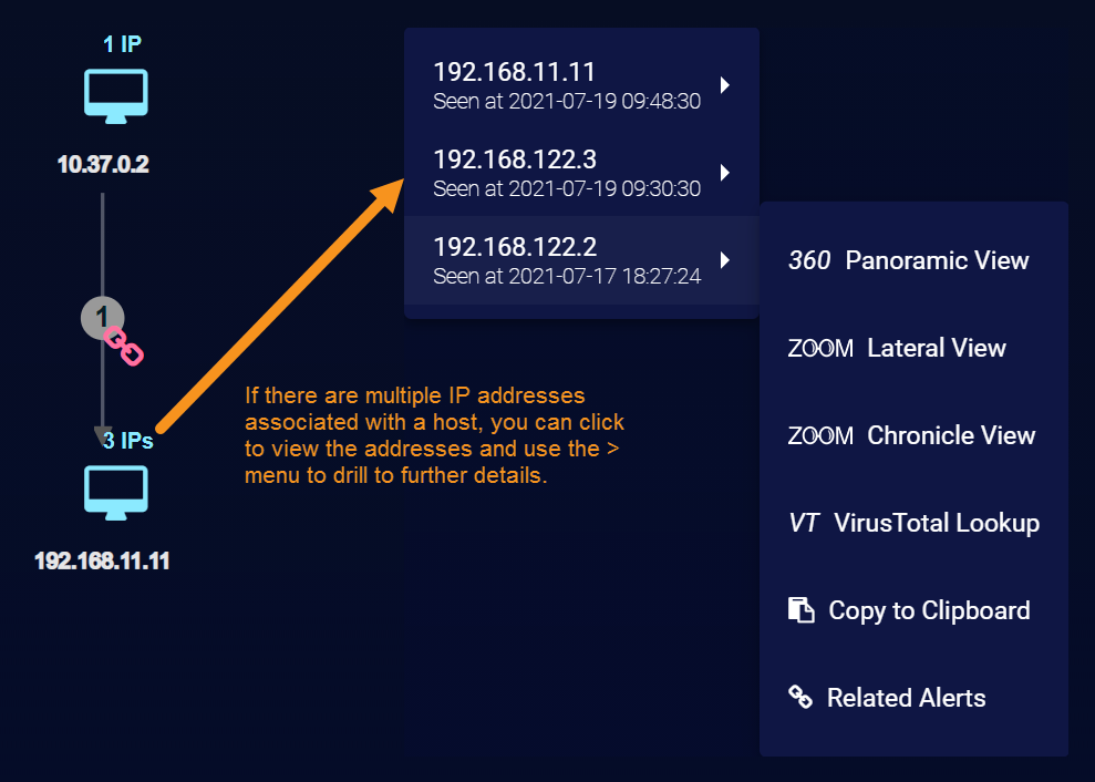
Multiple IP Addresses in the Analysis Tab
When Stellar Cyber detects multiple IP addresses on the same host, it displays a short message indicating the number of associated IPs. You can click the message to see a popup listing each of the detected IP addresses, including a timestamp of when it was seen and drilldowns for further analysis. The illustration below provides an example of a host with multiple associated IP addresses.
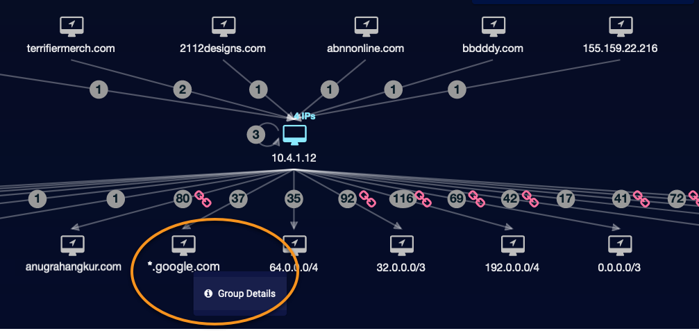
Grouped IP Addresses and Domains in the Analysis Tab
To simplify the visual impact of complex charts, Stellar Cyber automatically groups related nodes with a high number of alerts to or from a host node. For example, if there many alerts from a host to several addresses on different hosts in the same domain, the workspace displays only one icon for the whole domain.
The same grouping occurs for a high volume of alerts to hosts with IP addresses that can be effectively represented as an IP address range. This differs from the grouping of multiple IPs on a single host. In this case, the group is multiple, related IP addresses or domains on different hosts.
Grouping is indicated as follows:
-
For domains: The address below the host icon is the abbreviated domain prefixed with a wildcard (*.mydomain.com, *.corporate.otherdomain.net).
-
For IP addresses: The address below the host icon is replaced with a CIDR address, reflecting the scope of the group.
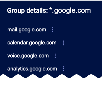
To display the group details, click the domain or address below the icon. This opens a short menu that lets you display Group Details. Click this menu to open a pane with a list of all the observed node addresses.
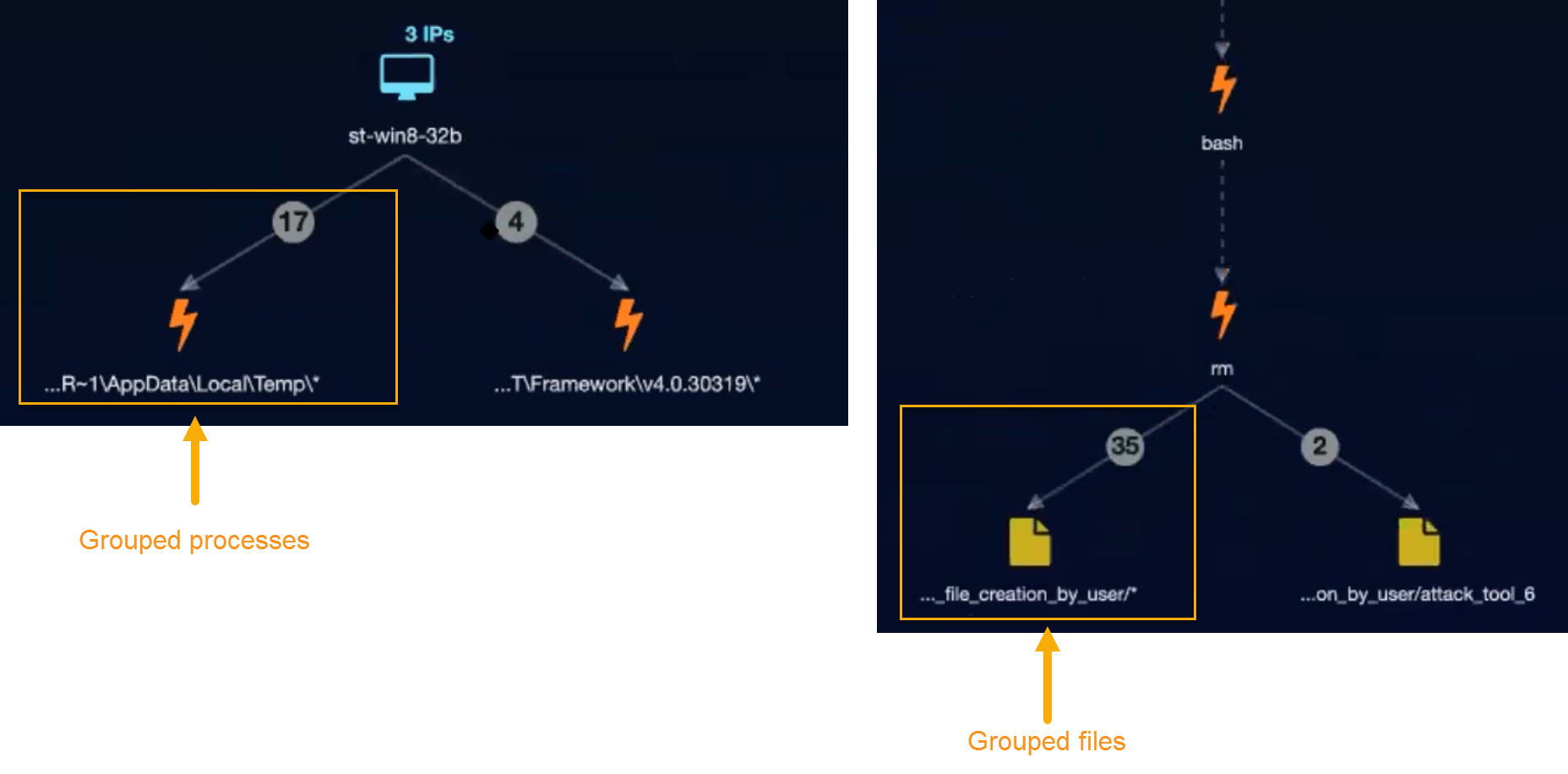
Grouped Processes, Files, and URLs
Stellar Cyber performs similar grouping for processes, files, and URLs in the Analysis tab. In situations where there are multiple files, processes, or URLs with the same alert type connecting to the same node, Stellar Cyber may display them in a summarized container to improve readability. You can always click on the entry below the grouped entities to access the Group Details menu and view the constituent members, complete with drilldown access for each. The figure below shows examples of grouped processes and files in the Analyze workspace:
Login Failure Alerts in the Analysis Tab
Login Failure alerts may include multiple usernames under the same special UserSID of S-1-0-0. This UserSID is used in WIndows when a SID value is not known. The Analysis tab still shows all the usernames associated with a Login Failure Alert under this SID. Keep in mind, however, that these user entities are not real users.
