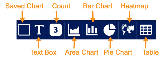
Custom Dashboard Components
When you add or edit a custom dashboard, you can add these components:
-
Saved chart—a previously saved chart
-
Text box—use this to add static text
-
Count—use this to add a dynamic count
-
Area chart—use this to visualize change over time
-
Bar chart—use this to compare several categories
-
Pie chart—use this to see the distribution of items compared to the total
-
Heatmap—use this to see a geographic distribution of source or destination IP addresses
-
Table—use this to add a simple table of data
-
Predefined chart—one of the charts built in to Stellar Cyber
Adding a Saved Chart
To add a saved chart:
-
Click Add saved chart. The selection screen appears.

-
Click the drop-down and select the saved chart.
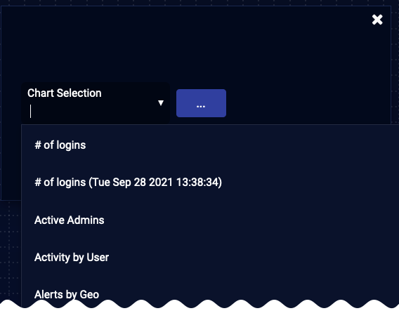
The chart is added and your canvas is displayed. You can still edit, delete, and move your chart.
Adding a Text Box
To add a text box:
-
Click the New text button. A text box is immediately added and your canvas is displayed.

-
Enter and format your text.
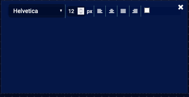
You can still edit, delete, and move your text box.
Adding a Count
To add a count:
-
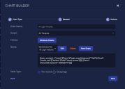
Click Counter. The Chart Builder dialog box appears.

-
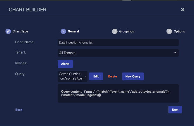
Enter the Chart Name. Ours is Data Ingestion Anomalies. This field does not support multibyte characters.
Special characters are not permitted in name fields for Queries, Lookup lists, Reports/Dashboards. Letters, underscores, spaces, dashes, numbers and periods are permitted.
-
Choose the Tenant. We chose All Tenants.
-
Choose the Indices. We chose Alerts.
-
Choose a saved Query or create a new query. The query is optional.
To remove a selected query, set the query value to None. Deleting it completely removes it.
-
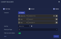
Click Next. The Groupings tab is displayed.
-
Choose the Metric. We chose Max and selected a metric in the displayed field.
-
Click Next. The Options tab is displayed.

-
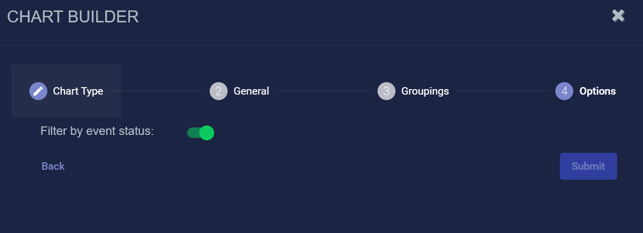
Use the Filter by status option to specify whether data in this chart is subject to the global Status filter available in the main toolbar:
-
Enabled (default) – Chart data can be filtered using the global Status filter in the main toolbar.
-
Disabled – Chart data is displayed regardless of the current setting of the global Stats filter in the main toolbar.
-
-
Click Submit.

The count is added and your canvas is displayed. You can still edit, delete, and move your chart.
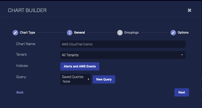
Adding an Area Chart
To add an area chart:
-
Click New area chart. The Chart Builder dialog box appears.
-
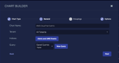
Enter the Chart Name. Ours is AWS CloudTrail Events. This field does not support multibyte characters.
Special characters are not permitted in name fields for Queries, Lookup lists, Reports/Dashboards. Letters, underscores, spaces, dashes, numbers and periods are permitted.
-
Choose the Tenant. We chose All Tenants.
-
Choose the Indices. We chose the Alerts and AWS Events indices.
-
Choose a saved Query or create a new query. The query is optional.
To remove a selected query, set the query value to None. Deleting it completely removes it.
-
Click Next. The Groupings tab appears.
-
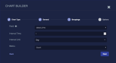
Choose the Field to group by. We set detect_time.
-
Choose the Interval Time.
-
Choose the Interval Unit.
-
Choose the Metric. We left it as Count.
If you choose anything but Count, enter the Metric Field.
-
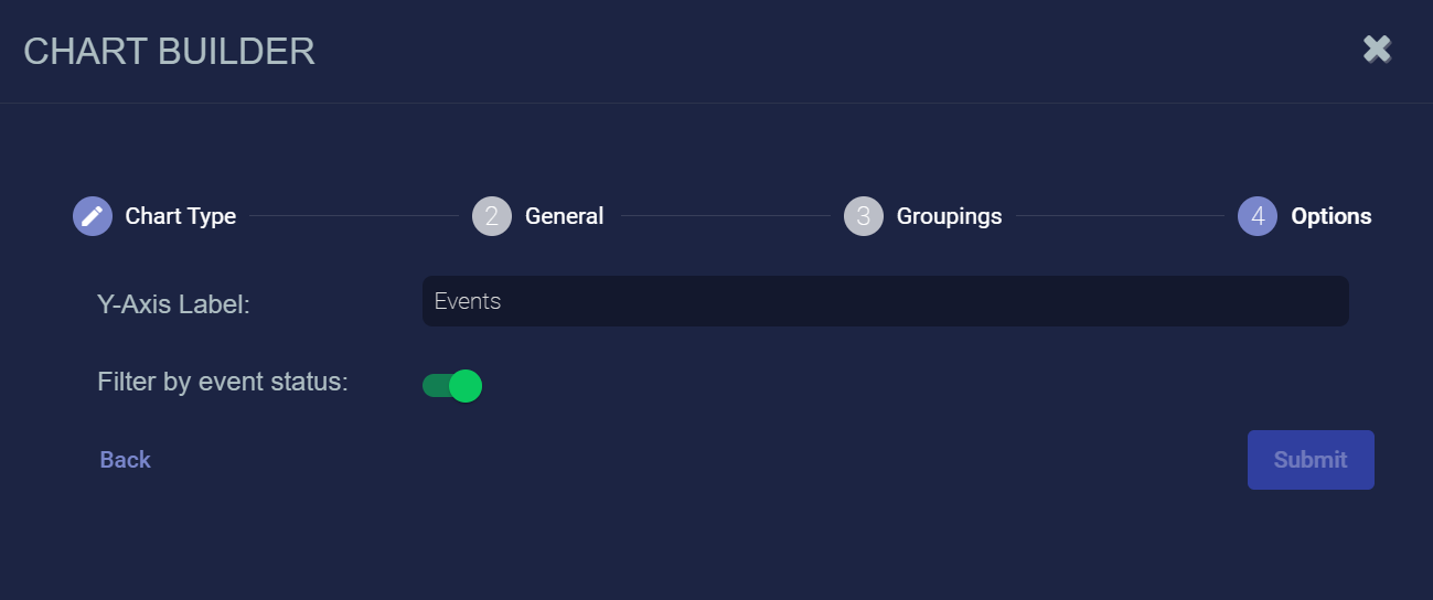
Click Next. The Options tab appears.

-
Enter a Y-Axis Label.
-
Use the Filter by status option to specify whether data in this chart is subject to the global Status filter available in the main toolbar:
-
Enabled (default) – Chart data can be filtered using the global Status filter in the main toolbar.
-
Disabled – Chart data is displayed regardless of the current setting of the global Stats filter in the main toolbar.
-
-
Click Submit.

The chart is added and your canvas is displayed. You can still edit, delete, and move your chart.
Adding a Bar Chart
To add a bar chart:
-
Click New bar chart. The Chart Builder dialog box appears.
-
Enter the Chart Name. Ours is Multiple User Login Fails. This field does not support multibyte characters.
Special characters are not permitted in name fields for Queries, Lookup lists, Reports/Dashboards. Letters, underscores, spaces, dashes, numbers and periods are permitted.
-
Choose the Tenant. We chose All Tenants.
-
Choose the Indices. We chose Windows Events.
-
Choose a saved Query or create a new query. The query is optional.
To remove a selected query, set the query value to None. Deleting it completely removes it.
-
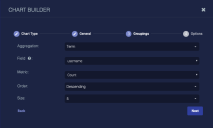
Click Next. The Groupings tab appears.
-
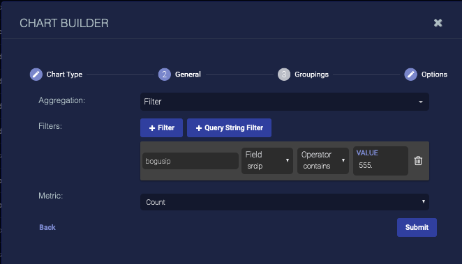
Choose the Aggregation. Choose Term to group data by the text in the fields (useful when your data is text, such as tenant names), choose Range to group data by ranges (useful when your data is numeric, such as severity), or choose Filter to define filters for the data groups.
Define your aggregation. The options differ based on your choice.
-
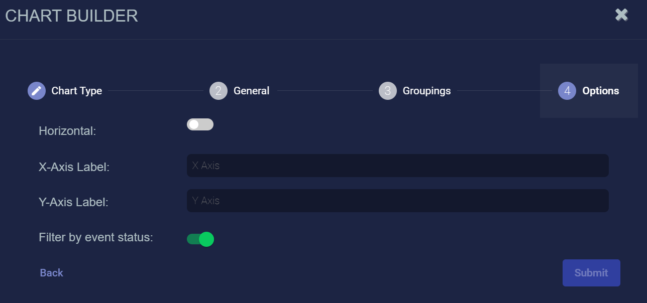
Click Next. The Options tab appears.

-
Choose Horizontal to display the bars horizontally.
-
Enter optional labels for the axes.
-
Use the Filter by status option to specify whether data in this chart is subject to the global Status filter available in the main toolbar:
-
Enabled (default) – Chart data can be filtered using the global Status filter in the main toolbar.
-
Disabled – Chart data is displayed regardless of the current setting of the global Stats filter in the main toolbar.
-
-
Click Submit.


The chart is added and your canvas is displayed. You can still edit, delete, and move your chart.
Adding a Pie Chart
To add a pie chart:
-
Click New pie chart. The Chart Builder dialog box appears.
-
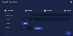
Enter the Chart Name. Ours is Source IP Addresses. This field does not support multibyte characters.
Special characters are not permitted in name fields for Queries, Lookup lists, Reports/Dashboards. Letters, underscores, spaces, dashes, numbers and periods are permitted.
-
Choose the Tenant. We chose All Tenants.
-
Choose the Indices. We chose Traffic.
-
Choose a saved Query or create a new query. The query is optional.
To remove a selected query, set the query value to None. Deleting it completely removes it.
-
Click Next. The Groupings tab appears.

-
Choose the Aggregation. Choose Term to group data by the text in the fields (useful when your data is text, such as tenant names), choose Range to group data by ranges (useful when your data is numeric, such as severity), or choose Filter to define filters for the data groups. The options differ based on your choice. In this example, we illustrate the fields that display when you add a basic filter. Define your aggregation.
-
Click Next. The Options tab is displayed.
-
Use the Filter by status option to specify whether data in this chart is subject to the global Status filter available in the main toolbar:
-
Enabled (default) – Chart data can be filtered using the global Status filter in the main toolbar.
-
Disabled – Chart data is displayed regardless of the current setting of the global Stats filter in the main toolbar.
-
-
Click Submit.

The chart is added and your canvas is displayed. You can still edit, delete, and move your chart.
To switch between a pie chart and a donut chart, simply click the or icon in the upper right corner of the component after you save the dashboard.
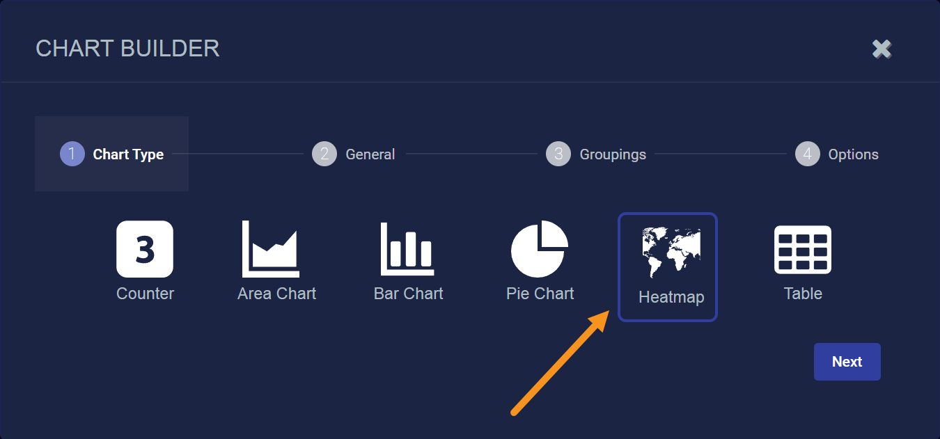
Adding a Heatmap
To add a heatmap:
-
Click New heatmap.
The Chart Builder dialog box appears with Heatmap selected.

-
Click Next.
-
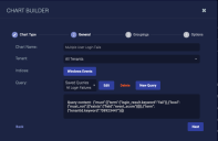
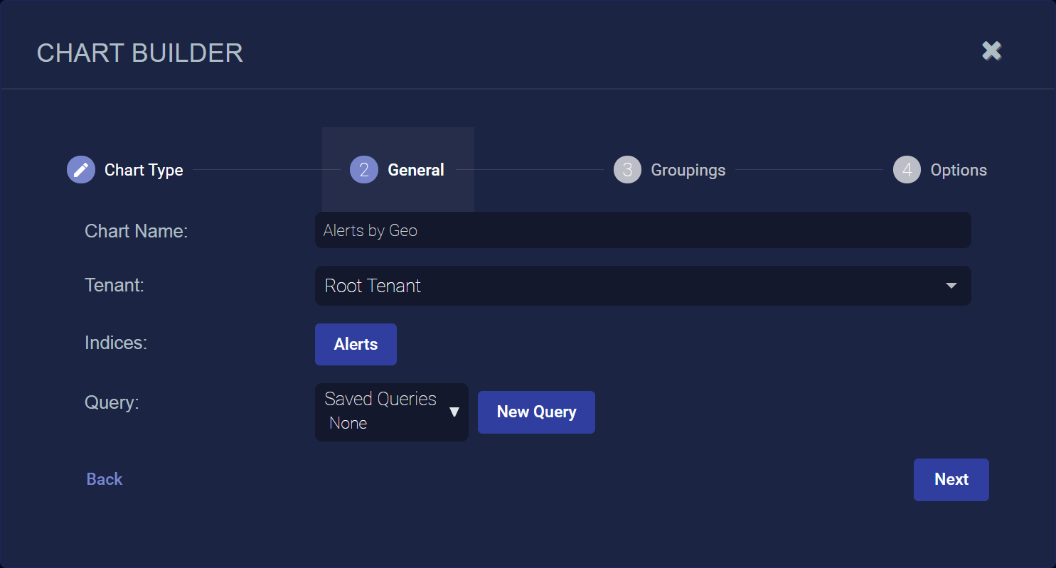
Enter the Chart Name. Ours is Alerts by Geo. This field does not support multibyte characters.
Special characters are not permitted in name fields for Queries, Lookup lists, Reports/Dashboards. Letters, underscores, spaces, dashes, numbers and periods are permitted.
-
Choose the Tenant. We chose All Tenants.
-
Choose the Indices. We chose Alerts.
-
Choose a saved Query or create a new query. The query is optional.
To remove a selected query, set the query value to None. Deleting it completely removes it.
Here's how the Chart Builder looks with our settings so far:
-
Click Next. The Groupings tab appears.
-
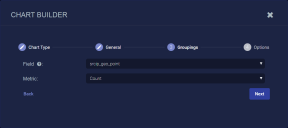
Choose one of the following Field types:
-
dst_ip_geopoint – Show heatmap based on destination IP addresses matching the query in the previous steps.
-
src_ip_geopoint – Show heatmap based on source IP addresses matching the query in the previous steps.
-
-
Choose the type of Metric to use for the Field. You can choose from Average, Count, Max, Min, or Sum. We have chosen Count so that the heatmap will display clusters based on alert counts.
-
Click Next. The Options tab appears.
-
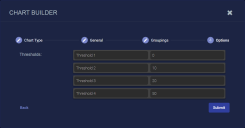
Name and set your thresholds. The thresholds specify at what value the heatmap will change the color codes of geopoints shown in the display. This way, geopoints with a higher count are displayed, for example, in red.
-
Use the Filter by status option to specify whether data in this chart is subject to the global Status filter available in the main toolbar:
-
Enabled (default) – Chart data can be filtered using the global Status filter in the main toolbar.
-
Disabled – Chart data is displayed regardless of the current setting of the global Stats filter in the main toolbar.
-
-
Click Submit.


The heat map is added and your canvas is displayed. You can still edit, delete, and move your chart. Be sure to save your changes when you are done.
Heatmap Example
The figure below illustrates a sample heatmap based on the settings we used in the previous procedure.

Note the following:
-
We configured the chart to display a heatmap based on the source IP addresses of detected alerts. The color-coded geopoints illustrate at a glance where the greatest number of alerts are concentrated based on the legend at the right of the heatmap.
-
Alerts are clustered into geopoints using an ElasticSearch GeoHash precision of 5, resulting in boxes of 4.9km x 4.9 km. For this example, this means that a geopoint shown in the heatmap represents all alerts within that 4.9km x 4.9km box.
-
Hover your mouse over any geopoint displayed in the heatmap to see its location, coordinates, and metric count. The example below shows a cluster of 109 alerts in the New York area.
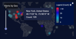
-
You can zoom the heatmap using slider at the left of the heatmap.

Converting Heatmap Charts from Previous Releases
The heatmap widget introduced in the 4.2.0 release is a complete replacement of the one used in previous releases and includes new geolocation capabilities. Note that any existing dashboards using a heatmap chart continue to use the old heatmap widget until you edit the charts manually using the following procedure:
-
First, identify the Dashboards using heatmap charts:
-
Navigate to Visualize | Creation | Charts.
-
Type heatmap into the Search box and press Enter.
The table updates to show only charts with a Chart Type of heatmap.
-
Sort the table in descending order by the In Use column. This way, the heatmap charts that are actually in use in a dashboard are listed at the top of the table.
-
Hover your mouse over the In Use column to see the name of the Dashboard(s) where each heatmap chart is used. Take note of these names.
-
-
Next, you need to edit the dashboards and replace the legacy heatmaps with new ones.
-
Navigate to Visualize | Custom (Dashboards).
-
Click the entry for the first dashboard with a heatmap chart you identified in the previous step.
-
Click the Edit button for the dashboard.
-
Take note of the settings for the existing heatmap, in particular the Indices and Queries.
-
Delete the existing heatmap by clicking the x in its upper right corner.
-
Add a new heatmap using the same Indices and Queries.
-
Click Save.
-
Repeat this procedure for any other dashboards using legacy heatmaps.
-
Adding a Table
To add a table:
-
Click New table. The Chart Builder dialog box appears.
-
Enter the Chart Name. Ours is All Login Failures. This field does not support multibyte characters.
Special characters are not permitted in name fields for Queries, Lookup lists, Reports/Dashboards. Letters, underscores, spaces, dashes, numbers and periods are permitted.
-
Choose the Tenant. We chose All Tenants.
-
Choose the Indices. We chose Windows Events.
-
Choose a saved Query or create a new query. The query is optional.
To remove a selected query, set the query value to None. Deleting it completely removes it.
-
Choose the Table Type. We left it as Per record.
-
Click Next. The Groupings tab appears if you chose the Groupings type. We chose Per record, so the Options tab appears.
-
Click the + Column button to add columns.
-
Choose the data for each column.
-
Enter a title for each column.
-
Enter the column to Sort By if you want.
-
Choose the Rows per Page.
-
Use the Filter by status option to specify whether data in this chart is subject to the global Status filter available in the main toolbar:
-
Enabled (default) – Chart data can be filtered using the global Status filter in the main toolbar.
-
Disabled – Chart data is displayed regardless of the current setting of the global Stats filter in the main toolbar.
-
-
Click Submit.


The table is added and your canvas is displayed. You can still edit, delete, and move your table. Here are examples of tables to look at events by:
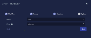
Adding a Predefined Chart
To use one of the many predefined charts built into Stellar Cyber:
-
Click the Saved Chart icon above the dashboard canvas. This places a chart selector in your dashboard canvas.
-
Click the next to the Chart Selection field on the new chart component you created. The Predefined Charts dialog appears.
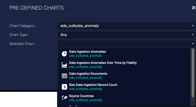
-
Choose a Chart Category to narrow your search. This is not necessary, but we recommend it, as there are many charts, and more are added at each release. In the example above, we enter a field to search for charts that use ade_outbytes_anomaly.
-
Choose a Chart Type to further narrow your search. We left the default selection of any.
-
Choose a Chart.
-
Click Submit.
The chart is immediately updated, and the name changed to match the chart you selected. You can no longer edit this chart, but you can select a different predefined chart.
