Service Visibility
The Dashboards | PREDEFINED | Service Visibility dashboard helps you better understand the traffic data ingested to the network (not security events). You might use this to optimize the network traffic and have better visibility from one network segment to another, such as private to private, private to public, public to private, and public to public.
The data in this display includes only raw traffic data that matches the current filter settings. See the Filters page for more information.
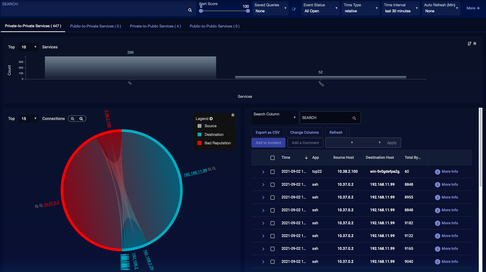
A sample screen is provided in the image below.
The tab bar at the top offers the following display options:
-
Private-to-Private Services – These connections occur fully within the private network.
-
Public-to-Private Services – When a connection starts from a public address to a private address it is placed in this category.
-
Private-to-Public Services – When a connection starts from a private address to a public address it is placed in this category.
-
Public-to-Public Services – This type of connection occurs between two public addresses.
When you select one of these options, Stellar Cyber adjusts the display accordingly. The components of the display are described below.
By default, the predefined dashboards show All Open alerts. You can use the filters at the top of the page to change which alerts are displayed.
Service Distribution
This section is at the top of the dashboard and shows a bar chart that lists the top applications being used and the number of connections that have occurred for each in the selected data.
Connection Chart
The Connection chart appears in the lower left corner of the dashboard and shows the top connections with their peers and colored by category. Use the following controls to work with this chart:
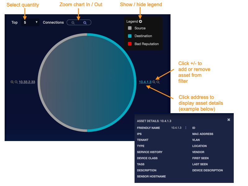
-
Top <number> Menu: This menu restricts the list of connections to the top <number> destinations and then, for those, the top <number> sources.
-
Chart Visibility: Use the zoom controls to the right of the Top <number> Menu to shrink or enlarge the chart. Use these controls, rather your web browser zoom controls to increase or decrease chart size. You can also drag the chart to a different location in the containing frame.
-
Legend: Illustrates the purpose of the chart colors. Select the white arrow to show or hide the legend. You can click or tap in the body of the chart to filter on one of the legend types (Source, Destination, Bad Reputation)
-
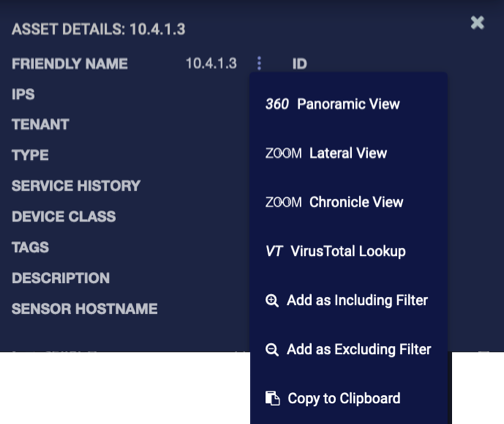
Asset Details: Select the asset label to display more details on the specific asset. From within the displayed dialog, you can perform a set of standard actions using that asset. Select the icon to display a menu and select the action you want to take.
-
Connection Selection: You can create a quick filter by clicking or tapping a chart segment. In the example below, there are more than 4000 connections occurring between the address pair of 10.4.1.10 and 192.168.11.11. Selecting this segment has added a filter to the overall dashboard.

Table
In the lower right corner of the dashboard a table is provided that provides access to each event in the data set that is currently selected. The data shown includes the time, basic information on the source and destination hosts, the application name and number of bytes transferred. For more information, select or tap the More Info button for an entry to bring up the Event Display for a specific record.
See the Tables page for more information on working with tables.
