Using the Legacy Kill Chain
This page provides users of previous versions with a familiar layout to use while learning the redesigned layout released with Stellar Cyber 4.1. Access this legacy page from the Visualize menu of predefined dashboards.
The Legacy Kill Chain dashboard is removed in 4.3.6. It is still available in 4.3.x releases prior to 4.3.6. ![]()
Overview
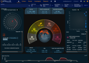
The first screen that appears after login is the Stellar Cyber Home page, which is set to the XDR Kill Chain, by default. You can access this legacy Kill Chain Dashboard from the Visualize | Predefined menu, and optionally configure it to become your Home page by clicking the Bookmark icon (see Utility Buttons, below). This display (as shown in the following figure) shows the overall status and health of the network observed by Stellar Cyber.
Understanding this page and how it works is an important first step in understanding Stellar Cyber and the information it contains. You can look at this screen and quickly determine what next steps to take — if any are needed — to keep the network and its systems secure.
Menu Bar
Use the Menu Bar at the top of the interface to navigate to any function in Stellar Cyber. This control appears on all screens.
Select these menu options to access the following features:
-
Click the Stellar Cyber logo to get back to the current Home page.
-
Cases: Manage cases– sets of multiple correlated alerts – reported by Stellar Cyber.
-
Alerts: Display a list of alerts observed by Stellar Cyber, organized by the XDR Kill Chain and analyzed with machine learning.
-
Visualize: Access both predefined and custom dashboards, as well as create and manage new dashboards and charts.
-
Investigate: Use selected views to perform threat hunting, search the Stellar Cyber database for information related to observed events, and view asset analytics.
-
Respond: Define your own alert types through automation, create and schedule reports, and initiate and manage actions such as user, firewall, or device actions taken in response to events.
-
System: Configure and administer Stellar Cyber and manage assets.
The currently active menu option is underlined.
Filter Controls
One of the most important sets of controls in Stellar Cyber gives you the ability to select which data appear in all the other displays. The filter controls appear near the top of the screen as follows:
Each combination of filters reduces the amount of data used for display and investigation.
The available controls are:
- Event Status—By default All Open events are included in the results.
- Time Type—The default is relative, but you can change it to daily or absolute. The control to the immediate right of Time Type changes based on your choice.
- Auto Refresh—The frequency with which results are automatically updated. The default is None.
Each of the controls take effect immediately, except for a Time Type of absolute.
See the About Filters page for a complete description of these controls.
The filter settings are persistent for the current session. So they are maintained when you go to a new page.
You can configure a preset filter for all of your views on your User Profile.
Search Tool

The search tool performs a simple search on the set of records displayed. Although easy to use, it is capable of complex search operations. For more information see the About Search page.
Selected Tenant
All records in the Stellar Cyber system are assigned to a tenant. In addition to the filter controls, search and query results can be narrowed to reflect only those records of a specific tenant. Alternatively all tenants can be included.
Stellar Cyber users assigned to a tenant, but who are not admin users, cannot change the tenant setting.
The selected tenant control is located at the top of the screen and is operated as a drop box.
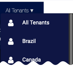
See the About Tenants page for more information on Stellar Cyber tenants.
The tenants setting is persistent within the current session. So it is maintained when you go to a new page.
Saved Query/Query Builder
With this control you can construct both simple and complex queries that search the Stellar Cyber database.
You can also save and retrieve queries.
See About Queries for a complete description on how to use queries.
The current query setting is persistent for the current session. So the query is maintained when you go to a new page.
Current User

The Current User tool shows the name of the currently logged-in user. It provides a drop-down box with the following functions:
-
Pause Animation—allows you to pause the status globe animation.
-
Profile—allows you to edit your user settings.
-
Logout—ends the current session and returns you to the Login page.
Utility Buttons

In the far upper right of the screen there is a group of buttons that provide access to general utilities. These might not appear if there is insufficient space in the current browser screen width. The buttons provide access to the following functions:
-
The bookmark icon is used to set or unset the default page displayed upon login or clicking the Stellar Cyber logo. Unsetting the bookmark restores the home page to the XDR Kill Chain.
-
The heartbeat icon opens the System Status page. When it is green there are no outstanding system health issues.
-
The thumbprint icon indicates that the DP is configured for forensic analysis.
-
The question mark button provides access to the system documentation, release notes, training videos, FAQs, support portal, and feedback.
Home Page Dashboard
The region below all the controls listed above is the Home Page Dashboard.
In Stellar Cyber the term "dashboard" refers to a collection of graphic components that are arranged to display a coherent story of a collection of related data. The Home page has a specific, preset dashboard. In many other screens other dashboards with different sets of components are shown. Many of these are customizable.
The following sections describe the visual components in the Home Page Dashboard.
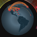
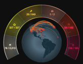
Status Globe
The center of the screen features the status globe, rotating continuously. When the current data selection includes data records that describe questionable network links, point-to-point arc lines are plotted in orange. Their end-points are the locations of the IP addresses included in the record (destination and source IP addresses).
Almost all of the end-points will terminate where one of the systems being monitored by Stellar Cyber is located. So a status globe with a high concentration of end-points where the protected systems are located is normal.
The primary use of this component is to show a quick global assessment of the amount of possible threats in the current data set. Click to navigate to the Bad Connections screen.
The display only shows the data in the system that is selected by the current filter.
Connection Graph
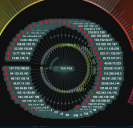
When you hover the cursor over one of the items in the Suspect Host List (described below), the Status Globe is replaced with a Connection Graph.
The center of the graph shows the IP address of the suspect host, and around it are the lines to the various IP addresses to which it has been connected. The lines are annotated by animated arrows showing the direction of the connection by moving away from the originator.
The purpose of this component is to give a quick appraisal of a suspect system. There are no clickable items on this component.
The display only shows the data in the system that is selected by the current filter.
Kill Chain Tachometer
Immediately surrounding the Status Globe is the Stellar Cyber Kill Chain Tachometer.
This is one of the most important data displays on the dashboard.
This display provides an immediate appraisal of the quantity and severity of the events Stellar Cyber has collected within the current filter settings.
The colors provide an intuitive visual key with regard to the severity of the event counters displayed. Each division represents one level of the kill chain from the lowest level at the lower left to the highest level on the lower right. Each section is marked with an icon that corresponds to the levels listed below. Each section is clickable to navigate to the associated kill chain display.
For more information see the Kill Chain page.
The icons also appear in the Security Events list section of the dashboard described below.
Each section of the arc shows two numbers:
- On the left is the number of critical anomalies from the data set that is currently selected. These events have been scored by the machine learning services as those most likely to need attention.
- On the right is the total number of anomalies detected.
The display only shows the data in the system that is selected by the current filter.
Detection Panel
This set of three panels is located immediately above the Kill Chain Tachometer. They are presented on the main dashboard to give quick access to important detection information in Stellar Cyber.
Click any of the panels to immediately go to the associated screen.
-
ML-IDS—Machine Learning IDS. The three numbers shown indicate the Critical, Total, and Raw events detected by the system. Click this panel to go to the ML-IDS page.
- Critical indicates the number of events with an Alert Score of 75 or greater.
- Total indicates the number of events
- Raw indicates the amount of data analyzed to find the events
-
Traffic Anomalies—The network analyzer's summary of the Firewall, Traffic, and Connection anomalies detected. The two numbers show the count of Critical and Total Anomalies. Click this panel to go to the Alerts page with the Legacy Network Traffic tag enabled.
- Critical indicates the number of anomalies with an Alert Score of 75 or greater.
- Total indicates the number of anomalies
- Malware Detection—The numbers indicate the count of Malware and All Files processed. Click this panel to go to the Malware Detection page.
Admin Panel
This set of three panels is located immediately below the Kill Chain Tachometer and presents very commonly used information. Click any of the panels to immediately go to the associated screen.
-
Found Assets—The numbers indicate the count of assets at risk, vulnerable, and the total included in the data set. Click this panel to go to the Asset Analytics page.
-
UBA Detections—The two numbers indicate the critical and total events detected. Click this panel to go to the Alerts page with the tag set to the Legacy User Behavior Analytics.
-
Daily Data Ingested—The first number indicates the amount of data processed by the data processor during the previous calendar day. The second number provides the total amount that the installation is currently licensed to process. Click this panel to go to the Licenses page, which controls how much capacity is currently licensed.
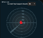
Suspect Asset Radar Graph
The radar display provides a quick appraisal of the status of the suspect assets in the current search results.
Dots on the graphic represent individual suspect assets. The highest risk assets indicated by the control at the top are shown.
The closer to the center of the plot that an asset appears, the higher its risk score. To get more details on the individual assets, see the Suspect Host list.
Click Top Users to see the Top Users by Risk chart instead.
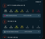
Suspect Assets List
The Suspect Assets list appears under the radar graph. It provides immediate access to the most urgent threats within the search results. The list is sorted with highest-risk entries at the top. Scroll down to see more entries.
Each row features the following information:
- Risk assessment. The number in the circle indicates risk. The highest risk is 100 and the least is zero.
- IP address of the asset.
- Kill chain footprint. Each number represents the number of anomalies that the asset is associated with. The color legend is the same as the kill chain tachometer.
- A description of the detection.
For each row of the table:
- Click on Risk Assessment to go to the Panoramic page with the asset pre-selected.
- Click on any of the kill chain counts that are non-zero to go to the appropriate Kill Chain page.
- Click on the button to the right of the IP address to copy the IP address to the clipboard.
- Click on the button to the right of the detection description to see the Interflow display.
When you hover the cursor over one of the entries in this list, the status globe in the center of the screen is replaced with a connection graph as described above.
Top Users by Risk Chart
The Top Users by Risk chart displays the users with the highest risk scores.
Click on a user to see details about that user.
Click on the Risk Score to see the User Details.
Click Top Suspects to see the Current Top Suspect Assets radar graph and Suspect Assets list.
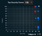
Top Security Events Chart
The Top Security Events chart is located near the upper right corner of the dashboard. This component provides a quick assessment of the security events in the search results.
Each point on the chart represents one or more security events. The chart provides three dimensions of information.
- The X axis indicates the severity of the event based on its position in the kill chain when detected. Events that are more severe are plotted to the right of less severe events.
- The Y axis indicates the fidelity of the event. Events that are more likely to be of concern are plotted higher on the chart than events of lower fidelity.
- The color indicates the threat level based on threat intel feeds and reputation. Blue indicates a notice, yellow a minor threat, orange a major threat, and red a critical threat.
Click individual points to see the Event Display panel. This panel provides complete information on the event.
Security Events List
The Security Events list is sorted with the highest risk events at the top.
Each entry in the table starts with an event type button, the name of the event, and its severity and fidelity scores. Click the button on the upper right to bring up the Event Display.
The remaining rows have information of interest from the Interflow record.
Events Over Time Graph
The graph at the bottom of the dashboard highlights the amount of activity that's occurred over the selected time range. This graph is useful for seeing anomalous event counts, which might be evidence of a security breach or other network problem.
